Dr Katie Parker on the UN’s vote to adopt a new world map
The Royal Geographical Society’s Cartographic Collections Manager, Dr Katie Parker, explains the Mercator projection and looks at the UN resolution to formally phase it out.
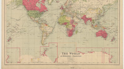
Maps have featured prominently in the news lately, largely due to a United Nations resolution encouraging the use of the Equal Earth projection in place of the widely used Mercator projection. The UN vote to adopt a new world map was primarily to reflect Africa’s true size. But how did the ‘standard’ world map come to be so widely used in the first place? And is there a straightforward way to represent our 2D world on a 2D surface?
Projections are ways to show the three-dimensional globe as a two-dimensional image. There is no way to flatten the earth, so to speak, without distortion. Imagine you are peeling an orange; it is impossible to remove the rind without ripping it in some way. This ripping, stretching, and displacement is the same thing that happens when cartographers design a projection.
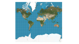
Projections are designed to answer a specific problem or facilitate a certain task. The Mercator projection debuted in 1569 in a famous world map by its namesake, Gerard Mercator. It was invented to aid navigation, making it easier to sail from one place to another. The genius of the map is that it makes lines of constant bearing into straight lines, thus making a ship’s course easier to plot. It is conformal, or angle-preserving. However, if a projection maintains one aspect, like angles, it usually distorts another. In this case, the Mercator projection exaggerates the size of landmasses in higher latitudes. This makes far northern and far southern landmasses appear much larger than they actually are.
Over time, use of the Mercator projection in contexts far removed from navigation has cemented a warped view of the world in many people’s minds, suggesting outsized importance for areas that appear larger and at the top of the map – especially Europe and North America. It is this linking of importance to size and centrality that African nations objected to, as Africa is undersized on a Mercator projection.
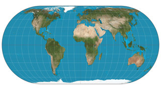
The UN has suggested the use of an Equal Earth projection, a projection created in 2018 by Bojan Šavrič, Bernhard Jenny, and Tom Patterson. It is an equal-area projection, meaning that it retains the relative size of landmasses. What is sacrificed, however, is the shape of those landmasses, with certain continents stretched more than others.
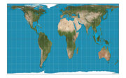
While many countries are now looking to use equal-area or other projections instead of the Mercator projection, there is no one projection that will fit all needs. Rather, teachers, researchers, and politicians should select the projection that best fits their purposes or questions. Teaching navigation? Keep that Mercator projection. Discussing global inequality? Perhaps use the Equal Earth projection. Interested in the world’s oceans? The Spilhaus projection might be for you. Love the world we live on? Check out a cordiform projection. No matter your geographic query, there is likely a projection that can help.
Map credits:
Mercator projection SW, via Strebe, licensed under the Creative Commons Attribution-Share Alike 3.0 Unported license.

Ecker IV projection SW, via Strebe, licensed under the Creative Commons Attribution-Share Alike 3.0 Unported license.

Gall–Peters projection SW, via Strebe, licensed under the Creative Commons Attribution-Share Alike 3.0 Unported license.

- RGS news
Society response to DfE consultation on new GCSE in natural history
Our response to the Department for Education's consultation on the proposed subject content for a new GCSE in natural history.
Tuesday 15 Sep 2026 - RGS news
Discover something new this autumn
Our autumn programme is jam-packed with insights from geographical experts as well story-telling, film, music and art. There is something for everyone, no matter where you are based.
Monday 14 Sep 2026 - RGS news

New range of discounts for RGS School Members
We are delighted to announce that the Society and Field Studies Council are unveiling a range of new discounts for RGS School Members.
Friday 11 Sep 2026