What is wildfire?
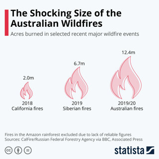
A wildfire is not likely to be something you have seen before. They are enormous, burning infernos which are unpredictable and very dangerous. The graphic below shows the difference in scale compared to the next largest fire. Summer 2019/20 has been one of the worst fire seasons on record in Australia, an area the size of Portugal or 12 times the size of the 2018 Californian fires, is burning.
Wildfires can be human-caused events or are triggered naturally. The problem with natural wildfire is that it can burn for hours before being detected by firefighters, it can therefore burn over large swathes of forest. To classify a wildfire, you must determine which part of the forest they burn in:
Ground wildfires are fires which burn on the ground only, often below the level of leaves
Surface wildfires burn on the surface of the forest with flames reaching as high as 1.3 metres
Crown wildfires are by far the most dangerous as they occur in the tree tops and can spread exceptionally fast. They are considered to be the most destructive, particularly as the fire can jump from tree top to tree top. This makes firefighting almost impossible
Where exactly are the fires?
There has been some confusion over map accuracy of the Australian bush fires, which raises important questions for geographers when sourcing content. This is particularly important whenever students cite authors, quote data and reference websites.
For live GIS data it is best to use the New South Wales Rural Fire Service website which is updated every 10 minutes although beware not all the symbols are bush fires. Equally for tracking wildfire in Victoria use the Victoria Volunteer Fire Service website. Other fire departments produce similar emergency condition maps.
Why has there been some confusion?
Misinformation has made the situation worse. The artist, Anthony Hearsey, produced ‘a visualisation of one month of bush fire data’ which was wrongly tweeted as a wildfire map by singer Rihanna. Others have misinterpreted symbols as proportional symbols or have used sites such as MyFireWatch, which collate data on all heat sources across Australia. Read more here.
This is an issue for all geographers to consider. How do you know your source is a reliable one? How can you collect trustworthy secondary data? When completing research think of our new acronym PEAT (reminding you, of course, that peat is a carbon store and yes, there are Australian peatlands.) Pause to consider if the source is:
Peer-to-peer reviewed?
Established as a well-known news outlet?
Argued in a well-reasoned way
Trade or professional quality? (written by practitioners in the field)
In Australia some residents might hear misinformation or look at inaccurate maps with dire repercussions if they initiate the wrong action for their fire plan. An example could be moving towards a dangerous wildfire rather than away from it. You can read about Australian fire plans from the New South Wales Rural Fire Service.