Ed Manley has mapped taxi journeys, foul language and the Queen’s Diamond Jubilee. A doctoral student at University College London (UCL), he uses digital mapping techniques to give unique, surprising and often beautiful geographical insight into the workings of the human world.
‘I have always loved maps,’ he says. ‘You can tell a story with a map. People can look at a map and associate it with their own experiences. As a form of visualisation, it makes information palatable.’
Ed is currently researching the movement of transport around the London road network for his PhD, although he also creates maps using data that he has collected from Twitter.
How did you start making maps using Twitter?
I found out about the Twitter data being publicly available with ‘geo-tags’, so I just started collecting it. Geo-tags allow you to locate a tweet to the point from which it was sent, to an accuracy of about five or ten metres. You can also very quickly collect tweets –20,000 a day in London alone.
So data collected from Twitter can be used to produce maps to a high level of detail. It is a rich resource for analysing how language varies over time and space. I typically try mapping the data in a number of different ways, which really gives you a sense of the geographical patterns.
How do you use maps of Twitter data to look for geographical patterns?
When I am analysing data from Twitter, all I am doing doing is looking at the spatial distribution of the tweets and seeing what catches my eye. I might see a cluster of activity and ask: ‘What is going here?’ I can then zoom into that area and explore it in some more detail.
For example, I might find that there was a Take That gig on at the O2 while I collected the Twitter data. If I drill into the data I will see that all of their fans were tweeting about the concert. These sorts of things become apparent when you put the data onto a map.
What other types of data do you use in your research?
Another part of my research uses a massive dataset of 1.5 million private taxi journeys, which used GPS technology to record the location of 3,000 taxis every 30 seconds for a three month period. This data was being collected by the private taxi firm.
I was trying to understand drivers’ route choice on an A-to-B journey. For that you need to follow an individual making an actual journey from A-to-B. But I did not just want to follow one person. The more data you have following people from point to point, the more reliable your results will be. So I wanted to find a data source that logged journeys. That is how I came to approach the taxi firm.
Where there any limitations in the secondary taxi data you used?
You have to get used to the fact that you are using only secondary data, which comes with a range of uncertainties to be minimised. For example, GPS technology works well in an open field. But when you are in the city, the signal bounces off the buildings. So there is a big uncertainty as to how accurate each point actually is.
I could have taken the raw log of one taxi route from A-to-B and corrected all of the inaccuracies by hand. But when you are dealing with 1.5 million routes, you need something more systematic. So I wrote a piece of computer code that would automatically work out where the most probable route was.
Even though you can improve the quality of the data, some of the inaccuracy will remain inherent. In analysing the results, you have to consider how representative they are of real people, and so their applicability in truly understanding the world around us.
Can maps be made use of in real-world decision-making process?
My research involves using the taxi data to create a computer model of the transport system and then changing certain factors in a virtual simulation, to see how it responds. These sort of simulation processes are designed to be practical and used in the real world.
Transport for London is sponsoring the research, so they are interested in using simulations to understand drivers’ behaviour and the impact of road structures on congestion. This understanding might then be used to minimise urban traffic congestion in future.
Best of the web: Digital maps
-
Locals and Tourists: Uses images uploaded to Flickr to visualise patterns of photography throughout the world’s most visited cities. Compares distribution of photos taken by locals and tourists
-
Electric City 2012: Uses maps and graphs to examine differing urban forms around the globe. Focuses on transport, energy and planning
-
London Surnames: Shows the prevalence of different surnames across London, coloured by the geographical origin of the surname
-
Youth unemployment mapped: With youth unemployment now near one million, this map of the UK lets you zoom in and click on your local authority to explore the data in more detail
-
Demographics by Housing in Great Britain: A modern-day reworking of the famous late 1800s Booth map of deprivation in Great Britain, colouring the streets of London according to the socio-economic status of housing
What can digital mapping bring to contemporary geographical understanding?
Digital mapping is all about layers – of roads, taxi journeys and Twitter data in my case. Understanding how such layers interact will give you a good idea of what is going on in any given area.
For example, on a map the Twitter data is represented as a layer comprised of thousands of individual points, each point signaling the location from which the individual tweets were sent. On top of this layer, I can overlay other layers of geographical information to give greater context to the Twitter data.
This layering of geographical information can build our understanding of the space in which particular tweets are distributed. As you layer more and more data on top, you begin to gain deeper insights.
How do you expect digital mapping to develop in the foreseeable future?
Digital mapping at the moment is all about comparing established data sets – such as official census data – with new datasets, such as those collected from Twitter. In 2013, the new census data will be released, which will provide researchers with an up-to-date, highly granular picture of Britain across a range of indicators.
In terms of technological developments, we have seen an increasing use of advanced computing methods for identifying spatial trends. Whilst mapping can give you one viewpoint on the data, there may be other dimensions that you cannot see with the human eye. ‘Machine learning’ is an increasingly used method that enables the automatic detection of hidden trends and comparison across different datasets.
Why did you choose to focus the majority of your research on London?
We really are driven by what data we can get our hands on and London is a fantastic source. The city has so much open data. It is way ahead of the game in that respect. Transport for London is one of the best transport organisations in the world in terms of the amount of data that they have openly available. Manchester is now beginning to make a lot of its data openly available too, so that may be the next UK city to watch.
What is it like living in London and researching it in so much detail?
It is also surprising how much my local knowledge of London counts. I can look at a map or a dataset and straight away say: ‘Well this bit makes sense but this bit does not. Why is this the case?’
I am always trying to look for things that are not obvious, unexpected behaviour that has never been seen before. It really helps living here in London. Digital mapping – and geographic research more generally – is often all about discovering something new about your area.
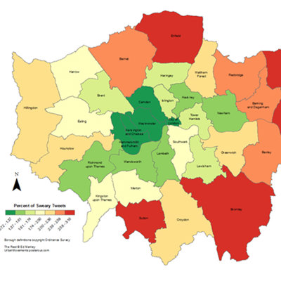
So did your data analysis unearth any interesting London trivia?
Well, I did a swearing analysis of Twitter activity across London. It was a bit of fun and a bit of nonsense really! My borough did not come out of it too badly. The analysis pointed to East London as apparently being much worse for swearing on Twitter.
I did think it was interesting how swearing varies over time. The swearing on Twitter clearly leapt up at night. It seems that people build up this anger over the day. Then they sleep, get up in the morning and are OK again.
You can find Ed’s latest digital maps on his blog.
Ed was interviewed in March 2013.
- Fieldwork
Colouring London
Colouring London aims to collect information on every building in London, to help make the city more sustainable.
- Lecture

Cutting-edge developments in mapping science - Jeremy Morley
School Member Lecture 21 September 2016
- Module
Mapping London
This module will take you on a journey through the way that London, a fascinating city, has been presented and represented over the years