

Geovisualisation
Discover how geographers bring a unique perspective to presenting data in innovative and understandable ways.
Find a geovis
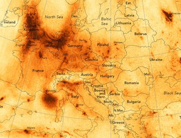
Air pollution in Europe
Discover how James Cheshire created this map displaying nitrogen dioxide levels across Europe.
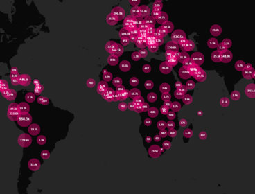
Mapping COVID-19
Andy Murdock describes how Maploom has created a visualisation which displays the evolution of the coronavirus (COVID-19) pandemic.
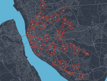
COVID-19 and access to testing in Liverpool
Dr Mark Green created this visualisation showing the accessibility of COVID-19 asymptomatic testing sites in Liverpool in November 2020.
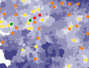
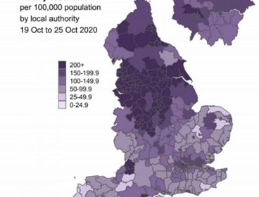
Journey times to acute hospital trusts in England
Discover how Dr Helen Roberts from the National Audit Office created this visualisation showing journey times to good and outstanding acute hospital trusts in England.
How England's complicated political geography is confusing coronavirus rules
As England emerged from its second national lockdown in early December, Boris Johnson, the UK prime minister, faced an onslaught of questions from MPs on both sides of the House of Commons.
Data visualisation expert on what’s wrong with the UK government’s coronavirus charts
“If you can’t convince them, confuse them.” If you watched the UK government’s COVID-19 briefing to announce and England-wide lockdown, you might have been reminded of this quote by Harry S Truman.
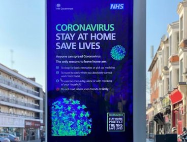
Life expectancy in the UK
Learn how Dr Kingsley Purdam created this visualisation linking life expectancy estimates with some of the most famous places and landmarks in the UK.
Geography has never been more important in helping us to understand our rapidly changing world.
Geographers bring a critical perspective and approach to interpreting and presenting data. They help make new connections between different types of data by interweaving spatial methods with knowledge about our world, and finding innovative and understandable ways to present it.
In this series of images, we look at the power of maps and geographical data visualisations for telling stories about our world. We explore the ways in which connecting data on people, places and environments underpins good decision-making and improves communication and understanding. In the interviews with the creators that accompany each image, we showcase the skills, data, techniques and tools used to tell these stories, and the insight they can bring.
If you would like to suggest an image for the series, or would like to take part, get in touch at policy@rgs.org.