Andy Murdock, Managing Director of Maploom, describes how Maploom has created a visualisation which displays the evolution of the coronavirus (COVID-19) pandemic.
View interactive COVID-19 map (external page)
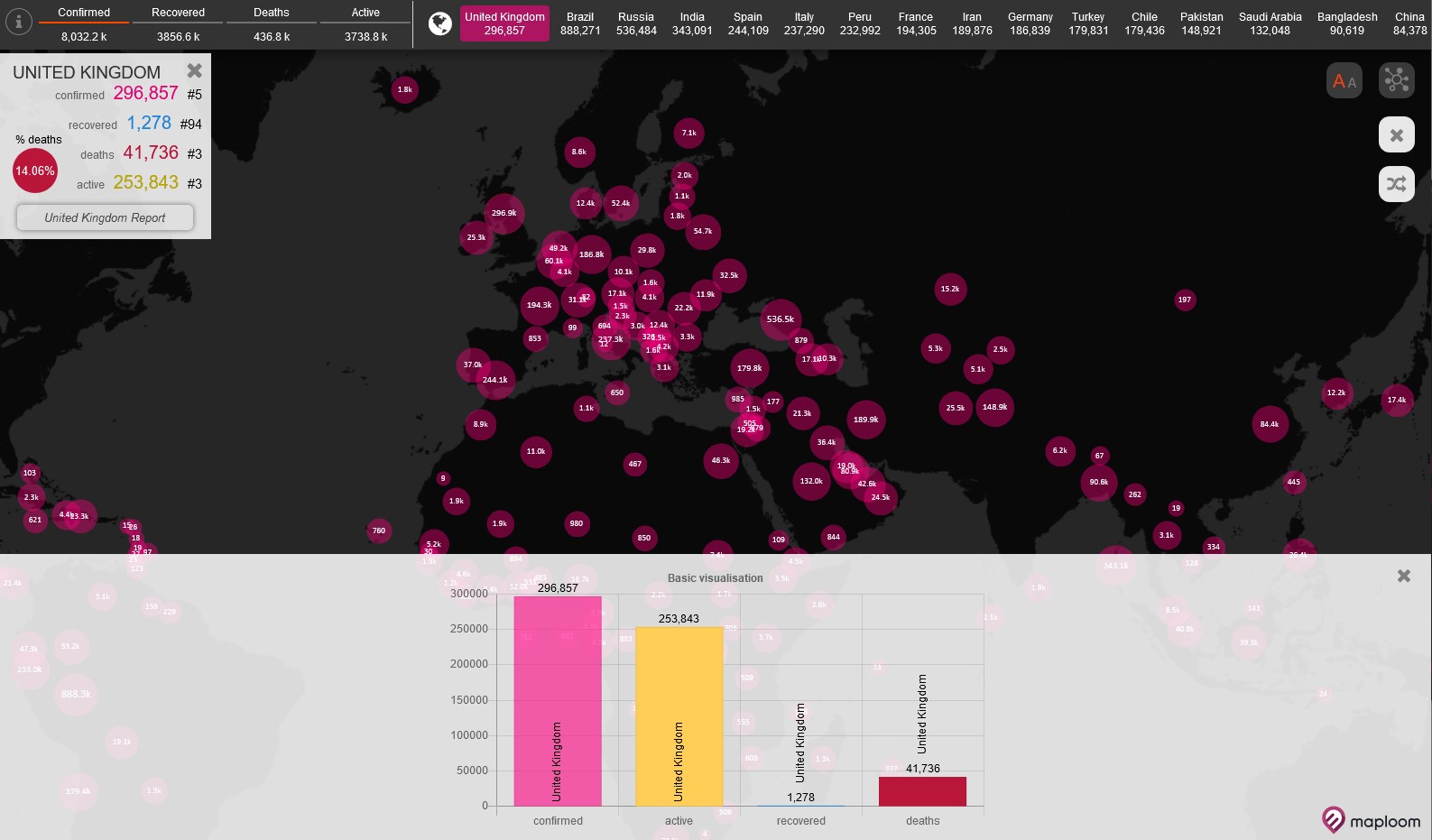
Explainer
Here Andy discusses why they created the visualisation, what tools were used and how you can recreate something similar.
What story does this visualisation tell?
The coronavirus (COVID-19) pandemic is a global crisis that is affecting us all, leading to a huge loss of life and suffering to millions. This is presenting huge challenges for health care providers in the many affected countries who need to work out how the virus is spreading and where best to target their resources. Geography plays a part in helping to understand the spread and evolution of the pandemic, and this has triggered a huge response from geographers worldwide. The wider public also wish to understand how their own country or region is affected to better comprehend the ongoing situation.
Maploom have created an open-access, online interactive map to display data for the pandemic. The website offers an up-to-date insight into the current situation, the evolution of the pandemic in different countries visualised through interactive maps, dashboards and automatically generated reports. This allows trends for specific countries to be compared side by side.
Why was it created?
Data for the COVID-19 pandemic is reported in different formats across the world, at numerous levels (national, regional, state etc.) and is constantly being updated. As geographers and data visualisation specialists we wanted to offer a consistent platform that allowed users to drill down into further data sources, offer meaningful visualisations and some alternative perspectives on the data. Key to this is the ability to compare and contrast data from different countries and show them side by side. We saw little of this functionality being provided elsewhere, so we have attempted to fill the gap.
The site is intended for information, educational and research use, and is aimed at a general audience so the tools are designed to be self-explanatory and easy to use. We’ve had recent interest from the media who are seeking more detailed area breakdowns. As with other geospatial providers at this time, we’re offering our skills and tools to assist the fight where we can and the site is offered for free.
What data did you use to create it and why?
For the country level we use a variety of sources including data collated by Johns Hopkins University, The European Centre for Disease Prevention and Control and other sources. All data sources are cited on the website.
We have started to include sub-national breakdowns with time series, where specific country data is available, starting with England, the US and Germany. The national breakdown allows information to be drawn directly and automatically from official sources in order to ensure figures are reliable and up-to-date.
While we aim to get back to the source data as far as possible, there is variation in what information is published and in the way the data are recorded, reported and presented. Additionally, some providers have also changed the format of the statistics published as the pandemic has progressed, for example in England. We are continually updating the site and are adding new detailed specific country breakdowns where we are able and reworking the data as new official figures are updated.
Why did you choose to present the data in this way over other approaches?
The COVID-19 pandemic is a fast moving, dynamic situation with standalone maps being only of use for a limited time. So the interactive maps and dashboards offer a more flexible approach and enables the latest situation to be presented. The fact that the data also form an ongoing record of the virus and its evolution, means that we are able to explore other visualisations through interactive charts and also recent trends (for example the last five days etc.). When we created the detailed specific country reports, there was not really anything else like it available in the public domain.
How have people engaged with the visualisation – what has it enabled people to do?
As the pandemic progresses our interactive map and tools are being used by more and more people, so far we’ve had users in at least 17 different countries access the site. Hopefully the tools have enabled users to drill into more detail and have allowed more flexibility in making inter-country comparisons, when it is not readily available for free elsewhere.
How else might this approach or data be used? How can the visualisation be taken a step further?
This approach is adaptable to any spatial dataset or global issue where comparisons between and within countries are needed, or where you need to track the evolution of trends over time.
Having a consistent way to view the data at different scales would allow much more powerful visualisation and analysis between areas. Standardisation of data (and APIs) is perhaps something which after this pandemic subsides, the World Health Organisation and others will discuss again. We will actively contribute to this debate.
Try it yourself
There are many different geospatial visualisation tools available. The most commonly used online GIS and dashboarding tools will allow you to go far; many allow an interactive map and timelines to be created. However, because these tools are usually designed for generic application and are mostly ‘widget’ driven, you don’t necessarily get the flexibility and originality that you would if you were to code some elements yourself specifically for this purpose (graphs and timelines etc.). This requires knowledge of how to code these tools.
Maploom’s core software also draws on a mixture of free and open source software (FOSS) tools including PostGIS and Open Layers, and for the dashboard elements, D3 and has been configured here specifically to the pandemic data.
Things to keep in mind
The biggest challenge is keeping all the datasets up to date. In the absence (in most cases) of web services providing the data in a machine readable format (APIs), maintaining data currency requires data harvesting tools which automatically check the data publisher’s sites regularly for updates and gathers the data (scraping). The figures vary in format and content so the harvesting scripts need to be specially adapted for each data provider. It would be a very laborious effort to gather the data manually, and would be open to transcription errors. Even with these automation tools, Andy and the Maploom team had to adapt the scripts to changes in published formats over time.
Care also needs to be taken with the representation of data, for example showing the case values for an area as a colour shaded (chloropleth) map. This can be misleading and open to misinterpretation, and so some form of population weighting is needed. Toggling the weighting button on the interactive UK report map, for instance, shows the impact this weighting has on the message the data conveys. There has been a lively debate among the ‘Geo’ community on social media about representation of COVID-19 data, which has explored this and other issues.
Similarly, interpreting the data also present challenges. For example, the percentage of deaths is likely to be significantly lower in most countries than the figure shown because the number of confirmed cases on which it is based is likely to be an underestimate of the true value. This is because there remain a large number of undetected cases where people are not displaying symptoms and are not hospitalised and / or tested. Therefore, these cases are not recorded (or confirmed).
About the creator
Andy Murdock is Managing Director of Maploom, a mapping, analytics and visualisation company offering a range of online services via the Maploom platform. He is a Chartered Geographer, chairs the Society’s Chartered Geographer Final Assessors Committee and is a member of the Professional Advisory Group.
You can follow Andy on Twitter at @APMurdock.