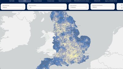
The Digital Exclusion Risk Atlas
In this interview, we speak to Karol Leszek Kuczera and Will Jones on the work behind the Digital Exclusion Risk Atlas (DERA), and how the geospatial tool aims to contribute to efforts to reduce health inequalities.
Commissioned by NHS England’s Healthcare Inequalities Improvement Programme and developed in partnership with NHS South, Central and West, DERA is designed to help health and care system teams understand and identify patterns of digital exclusion risk across England.
By visualising digital exclusion risk at neighbourhood level, DERA helps organisations move beyond regional averages and identify communities that may benefit from targeted support.
Digital exclusion risk describes the relative likelihood that people in an area may face barriers to accessing or using digital services, bases on factors associated with digital exclusion.
What story does this tell?
DERA shows that patterns of digital exclusion risk vary across England, reflecting a range of factors, such as access to devices, connectivity and digital skills. This means that the profile and potential drivers of digital exclusion risk can look quite different from one place to another.
These become clearer when data is examined at a local level, highlighting variations that can be hidden within national or regional averages.
Why was it created?
Before DERA, a number of useful approaches to mapping digital exclusion risk already existed. These included the Greater Manchester Digital Exclusion Risk Index as well as more locally developed approaches such as the Cheshire and Merseyside Digital Exclusion Heatmapping Tool.
However, approaches and relevant data were spread across different tools, datasets and geographical areas. DERA was developed to build on this existing work by bringing a broader range of indicators together within a consistent, national NHS-focused tool, designed specifically to support health and care planning and service design.
DERA also aligns with the NHS Core20PLUS5 approach to reducing healthcare inequalities, including its focus on the most deprived 20% of the population and locally identified groups experiencing poorer access, experience or outcomes. The Atlas can help identify geographical areas where digital exclusion risk may warrant further analysis, local engagement or targeted support.
Who was it created for?
We developed DERA for those involved in planning and delivering health and care services.
This includes Integrated Care Boards (ICBs), NHS providers, population health and analytical teams, health transformation teams, and Primary Care Networks.
We also created DERA for local authorities as well as voluntary and community sector organisations, to support targeted policy interventions and help inform local engagement
Tell us how you collected and analysed the data
Development of the index was informed by stakeholder and subject-matter expert input, alongside existing evidence and the availability of suitable national datasets.
Using this feedback, and our research, we selected a set of indicators and assigned a weighting to each one based on its likely contribution to digital exclusion risk.
This resulted in 12 chosen indicators, grouped into four domains, representing different dimensions of digital exclusion risk:
- Digital access and capability
- Affordability and economic pressure
- Ability and skills
- Agency, motivation and trust
To build DERA, we brought together data from a range of open and publicly available sources. These included the Office for National Statistics (ONS) for census and crime data, Ofcom for connectivity data such as broadband and mobile coverage, and the Indices of Deprivation (IoD) for measures relating to income and deprivation.
This data was analysed at Lower Super Output Area (LSOA) level, each LSOA typically contains between 1,000 and 3,000 residents, or approximately 400 to 1,200 households.
Because the data came from different sources and was measured in different ways, it was converted to a common scale from 0 to 100. This made it possible to compare all 12 indicators and four domains fairly and create a reliable index.
The weighted indicators were then combined into domain scores, which were themselves normalised before the four domains were weighted and combined into the overall DERA score.
Why did you choose to present the data in this way over other approaches?
We wanted to highlight the spatial patterns of digital exclusion risk, and a map provides a clear and intuitive way to communicate this information.
Transparency and openness were key principles in the design of DERA. The map is built with ESRI tools, using publicly available data. We included zoom and filter functions that allow users to focus on particular areas of interest. These are accompanied by information boxes which are displayed once an LSOA is selected.
The map also includes multiple pages, with separate maps of each of the four domains. This provides users with the ability to compare areas and datasets at both national and neighbourhood (LSOA) levels.
What steps did you take to ensure the data was accessible to a wide range of viewers?
We worked closely with the NHS Accessibility Lab, who reviewed the map and provided feedback on accessibility features, including alt text, navigation across different devices, and inclusive colour choices. We were deliberate with our colour scale when developing the map, incorporating colour schemes that are colour-blind friendly and used distinct colour palettes for each domain to improve usability and interpretation.
This was particularly important given the focus of DERA on digital inclusion, ensuring the tool itself is as accessible as possible.
How has the tool been used and engaged with since its launch?
Since the launch of DERA in April 2026, we’ve seen over 10,000 page views from 4406 active users and 3700 engaged sessions
Within the NHS South, Central and West’s organisation DERA has also become the most-used geospatial application since its launch.
We’ve also seen strong stakeholder engagement through professional advocacy activities, collaborating with organisations like Local Government Association (LGA), Good Things Foundation and the Digital Poverty Alliance.
We’ve also established a dedicated online community for users interested in exploring DERA in more detail, currently consisting of 1,344 members as of August 2026.
How else might this approach or data be used?
Within healthcare systems, DERA could be combined with local knowledge to build a more complete understanding of digital exclusion risk and explore whether areas of higher risk also experience different patterns of access or engagement. This could include incorporating information on digital service uptake, appointment booking methods, missed appointments, communication preferences, demand for telephone or face-to-face support, among others.
Where appropriately aggregated data are available, DERA could also be considered alongside NHS App uptake or usage data to explore whether geographical patterns of digital exclusion risk overlap with patterns of engagement with digital health services. This could help identify areas where further investigation, engagement or additional support may be warranted.
Beyond digital exclusion risk, the methodology could be adapted and applied to other sectors, offering a way to create similar risk indices and interactive maps addressing other policy areas.
To finish with, what’s your top tips for geographers looking to visualise data in this way?
Be clear about your objective and what you’d like to answer, but also, think about how your map could prompt new questions and lead to further discussions.
Consider how you’re presenting your data and focus on highlighting the key patterns you want the audience to understand quickly and clearly.
Regularly seek feedback and engage with people who challenge your thinking. This can help broaden your perspective and ensure your work is purposeful and impactful.