Geovisualisations
Discover how geographers bring a unique perspective to presenting data in innovative and understandable ways.
Search
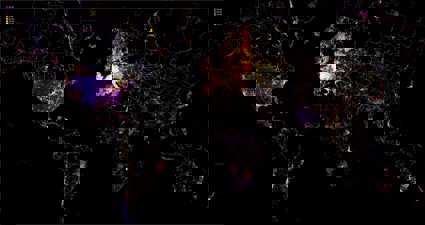
Green to Grey
In this discussion, we speak to Zeynep Şentek and Léopold Salzenstein from Arena for Journalism in Europe. We discuss their work as part of a major cross-national project, Green to Grey, which shows Europe’s extent of lost nature and cropland in Europe.
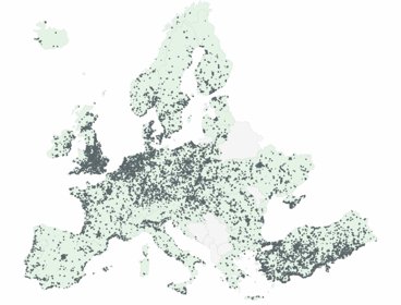
The Extended Project Qualification Interactive Map
In this discussion, we speak to Professor Helen Walkington and Dr Graham Wood about their work behind the interactive Extended Project Qualification (EPQ) Map. The map explores the spatial patterns of EPQ provision, uptake, and attainment in relation to place-based measures of deprivation in England.
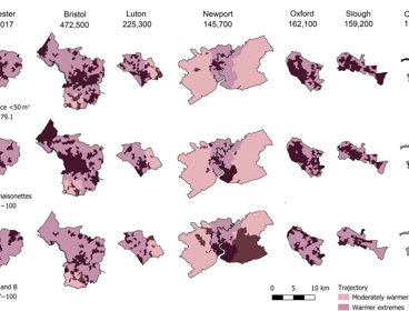
Uneven ambient futures: intersecting heat and housing trajectories in England and Wales
In this discussion, Dr Caitlin Robinson explores the visualisations featured in her recent paper: ‘Uneven ambient futures: intersecting heat and housing trajectories in England and Wales’, developed in collaboration with Lenka Hasova, Lin Zhang and National Energy Action .
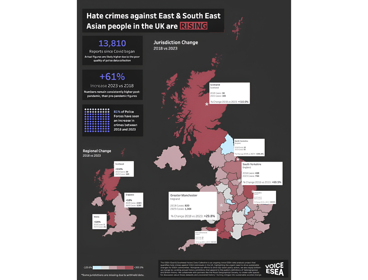
Mapping hate crimes against East and Southeast Asian (ESEA) communities in the UK
Shermaine Yung, a volunteer at Voice ESEA, discusses Voice ESEA’s data collective which quantifies hate crimes against East and Southeast Asian (ESEA) communities and individuals in the UK.
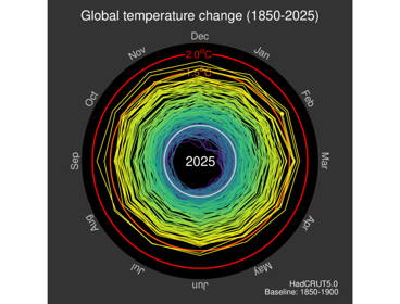
Animated spiral of changes in global temperature (1850-2025)
Professor Ed Hawkins, leading climate scientist and communicator within the National Centre for Atmospheric Science at the University of Reading, discusses the creation of his viral climate spiral visualisation.
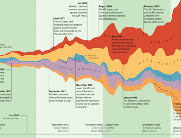
Weaponizing finance
Liam Keenan, Assistant Professor in Economic Geography at the University of Nottingham, discusses the creation of this stream graph, which illustrates the geographical distribution and evolution of financial sanctions since 1950.
Mapping of social sciences, humanities and arts (SHAPE) provision in UK higher education
Ruairí Cullen, Lynton Lees and Pablo Roblero from the SHAPE Observatory at the British Academy discuss their interactive tool which maps cold spots and changes in the provision of social sciences, humanities and arts (SHAPE) in the UK higher education sector over the last decade.

Mapping England's hedgerow landscape
Josep Serra Gallego, a Spatial Data Scientist at the UK Centre for Ecology & Hydrology, discusses the UKCEH Hedgerow dataset, aimed at guiding the planting and restoration of these vulnerable habitats.
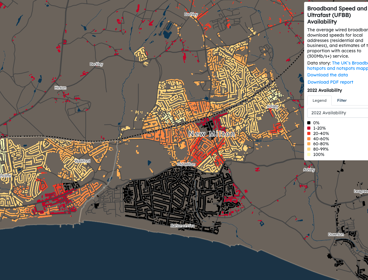
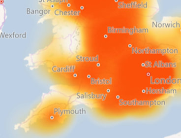
Mapping broadband speed and ultrafast availability
Oliver O’Brien, Senior Research Associate at University College London (UCL), discusses the Broadband Speed and Ultrafast Availability data shown on CDRC’s interactive mapping website.
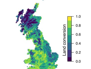
Mapping land-use change in Great Britain over the 20th century
Andy Suggitt and Alistair Auffret discuss how a chat over coffee led to them mapping and quantifying land use change in Great Britain from the 1930s to today.
AI within a geospatial context
Steve Attewell has created an experimental map control system that uses hand gestures, voice recognition and artificial intelligence.
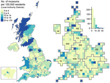
Mapping museums
Andrea Ballatore and Fiona Candlin used visualisations to better understand the spatial unevenness of the cultural sector across the UK.
About the geovisualisations
Geography has never been more important in helping us to understand our rapidly changing world.
Geographers bring a critical perspective and approach to interpreting and presenting data. They help make new connections between different types of data by interweaving spatial methods with knowledge about our world, and finding innovative and understandable ways to present it.
In this series of images, we look at the power of maps and geographical data visualisations for telling stories about our world. We explore the ways in which connecting data on people, places and environments underpins good decision-making and improves communication and understanding.
In the interviews with the creators that accompany each image, we showcase the skills, data, techniques and tools used to tell these stories, and the insight they can bring.
Get in touch about geovisualisations
If you would like to suggest an image for the series, or would like to take part, get in touch at policy@rgs.org
Impact of geography
Explore the impact of geography through our case studies and resources.
Choose geography
Geographers are among the most employable university graduates. Find out more about choosing geography at GCSE and A Level, continuing to study geography at university, and the career paths that geography opens up for you.