Green to Grey
In this discussion, we speak to Zeynep Şentek and Léopold Salzenstein from Arena for Journalism in Europe. We discuss their work as part of a major cross-national project, Green to Grey, which shows Europe’s extent of lost nature and cropland in Europe.
What story does this visualisation tell?
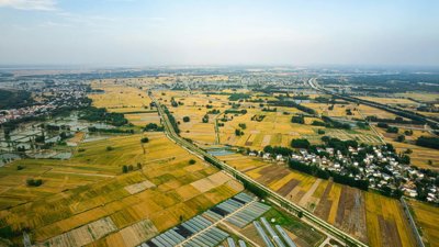
The visualisation shows the scale of change from undeveloped ‘green’ land to developed ‘grey’ land across Europe.
Rather than focusing on individual countries and locations, the visualisation portrays the scale, spread, and ongoing nature of land take across Europe.
Why was it created?
We created Green to Grey to challenge the belief that Europe is a comparatively protected continent by showing how forests, wetlands, farmland, and other natural or semi-natural areas are being converted into built-up land.
We were inspired by a previous project undertaken by the Norwegian Broadcasting Corporation (NRK), which showed how much nature in Norway was being lost to construction.
We wanted to make something similar across a continental scale via a cross-national collaboration project, where we could quantify and visualise the extent to which green, undeveloped areas are being lost to construction throughout Europe.
Who was it created for?
Our primary audience was the general public. Using a visualisation communicates the extent of nature loss in Europe to a wide audience, and we ensured the visualisation was accessible across countries and languages, publishing the work in 11 different languages through our media partners.
Our secondary audience included policymakers, civil society groups, and journalists, providing them with a resource which visually conveys the scale of nature loss across Europe and can be used to inform debate.
Lastly, our audience included scientists and data researchers, for which we published a detailed and transparent methodology alongside the story.
Tell us about the data (type, source, quality)
To source the data, we used an open-access dataset called Dynamic World, put together by Google and the World Resources Institute.
This dataset consists of satellite images taken globally every few days, and each 10×10 metre pixel is classified into a land cover type — things like forest, cropland, built up areas, wetlands, bare land, and so on.
What methods did you use to collect, analyse and present the data?
To analyse the data, we used an existing methodology designed by Norwegian Institute for Nature Research (NINA).
Using machine learning, we analysed Dynamic Earth’s archival data, with the algorithm classifying each pixel according to land cover. We then grouped these pixels into polygons (a group of pixels put together), so we could see larger areas where land had changed, more specifically where natural areas transformed into built-up areas.
It’s important to highlight that using AI and machine learning produced some errors where pixels were incorrectly misclassified as being built on.
We couldn’t verify everything manually with the sheer amount of data. Instead, we used a scientific sampling method, where we manually verified more than 10,000 points using high resolution satellite images to see if they really were built on or not. This allowed us to calculate how accurate the model was and approximately quantify the uncertainty in the data.
We then used QGIS to transform the polygons into single points onto a map. We used only the largest polygons to make the map easier to read and to reduce potential false positives.
Why did you choose to present the data in this way over other approaches?
We made several intentional choices on how the map is presented.
We specifically did not include a zoom feature on the map. This was to emphasise the overall of scale of nature loss within Europe rather than focusing on detailed data for local areas.
We also added blinking points that appear as the map loads. This was meant to highlight that nature loss is ongoing across Europe and to make the issue more striking and immediate for the public.
The map was accompanied by other forms of data, such as satellite images, drone footage, graphs and pictures, which adds important context to the wider story of nature loss in Europe for readers.
Lastly, we added a small timer at the end of the map, showing how much nature has been lost at the specific point when the reader gets to the end of the visualisation. This was done to make the map more emotionally impactful to the readers.
What impact has the visualisation had in research, policy or other contexts?
Since launching the findings in October 2025, we’ve already seen a range of impacts and engagement.
The project received widespread public attention and significant press coverage following its release. Within the first month, it garnered around 3 million unique views across our 11 media partners and was featured in major newspapers across Europe, such as The Guardian and Le Monde.
The findings were discussed in the parliaments of Belgium and Türkiye, and in Türkiye, MPs are currently proposing to establish an investigative committee to examine the results.
Civil society groups in Italy also used our findings to support legal and advocacy processes to protect Lake Garda in Northern Italy.
The findings have also been adopted into university teaching in countries such as Türkiye, within urban planning courses and modules.
Through our methodology, we were contacted by the European Environment Agency (EEA) as our research discovered a much larger scale of nature loss than they found. This has prompted discussion about improving official land-use metrics and measuring nature destruction.
How else might this approach or data be used?
destruction. One of our partners, NINA, has developed a public crowdsourcing project to track nature loss on a global level.
Through our use of AI and machine learning, our methodology demonstrates how these tools can be used ethically and responsibly.
This approach does come with some level of uncertainty, but we have addressed this by quantifying the error rate, providing a way to manage it without needing to re-verify all the data from scratch.
To finish with, what’s your one top tip for geographers looking to visualise data in this way?
Be clear about who your audience is and what you want them to understand through the visualisation. Focus on the meaning and purpose of the work and be honest about uncertainty or limitations.
Really understand what your data is made of at the most granular level. That understanding helps you decide how to present your data, how to scale it best and what it can show.
For more
Explore the visualisation: greentogrey.eu