Uneven ambient futures: intersecting heat and housing trajectories in England and Wales
Dr Caitlin Robinson is a Senior Academic Fellow in Geographical Sciences at the University of Bristol. Her research maps the geographies of energy, inequality and infrastructure.
In this discussion, she explores the visualisations featured in her recent paper: ‘Uneven ambient futures: intersecting heat and housing trajectories in England and Wales’, developed in collaboration with Lenka Hasova, Lin Zhang and National Energy Action.
What story do these visualisations tell? Why were they created?
"The visualisations explore how people are exposed differently to extreme summer temperatures, particularly focusing on the role that housing plays in shaping vulnerability.
"We used a relatively new dataset containing information on housing characteristics derived from Energy Performance Certificates (EPCs) for people's properties. This dataset gave us lots of information about the built environment.
"We coupled this with data on future heat extremes, examining how poor-quality housing is likely to intersect with extreme temperatures and enhance vulnerability."
Who were they created for?
"The visualisations are intended for people working in energy and housing policy, especially as you can look at the data in fine detail at a neighbourhood scale.
"The visualisations are a valuable tool for provoking discussion and helping us identify which communities might be most impacted by extreme summer temperatures."
Tell us about the data
"We used three datasets to create the visualisations.
"The first is UK Climate Projections (UKCP) data (1981-2080). This dataset is based on Met Office UK climate trajectories (2018) and includes projections for three 20-year periods: 1981-2000 (estimating backwards), 2021-2040 (present day), and 2061-2080 (future estimates).
"We analysed the projections at a small scale (2.2km scale) mapped on a 5km2 grid. We focused on summer maximum temperatures as illustrative of heatwave risk.
"The second is housing data derived from Energy Performance Certificates (EPCs), available at the Unique Property Reference Number property scale. We aggregated this data into Lower Super Output Areas (LSOA).
"LSOAs are small geographic areas at the neighbourhood level. We calculated averages at this neighbourhood scale, in part to help compensate for gaps in the EPC data.
"If a property has not been sold in the last 20 years or isn’t rented, it might not have an EPC. In many areas, we found quite a sizeable chunk of properties with missing data, and so by averaging at the neighbourhood scale, we aimed to provide a good sense of these properties.
"This approach allowed us to capture all sorts of different property characteristics, including: size, floor area, energy efficiency, age, and type of heating source. These characteristics influence how vulnerable people are to extreme heat.
"The third is wider socio-demographic and housing data from the 2021 Census at LSOA scale to provide wider contextual information."
What methods did you use to collect and analyse the data?
"The data is all secondary. The main work in collecting and cleaning the data related to the EPCs. It was quite challenging cleaning the EPC data, thinking about which properties to include and aggregating the information.
"The task was even more complex due to the size of the dataset, which comprised around 15 million properties.
"The datasets are also in slightly different formats. The climate change projection data is a raster dataset, so effectively it is a surface made up of grids. In contrast, the housing dataset involved vector data along neighbourhood boundaries.
"We had to think about how to marry those different types of data and analyse the information together."
What tools did you use to create the visualisations?
"We used R for most of the analysis. There are lots of really good packages for analysing spatial data in R that are open source.
"Once we got to creating the visualisation, we put the data into QGIS so we could play around with different colours and layouts with ease."
Why did you choose to present the data in this way over other approaches?
"We were keen to examine extreme heat in less-studied areas of the UK. Research on residential heat stress is often focused on London, which might be seem an obvious choice from the point of view of extreme heat.
"We decided to research places like Slough, Crawley and Luton, which are not only understudied but are also experiencing extreme heat (see Figure 1)."
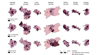
"Bivariate maps can divide the crowd, but I find them to be effective. In this research (see Figure 2), they work particularly well, partly because the variation in the data was not usually large, making it possible to display the results clearly in one visualisation."
What impact have the visualisations had in research, policy or other contexts?
"The research is relatively new and so I am keen to do more work sharing our results."
How else might this approach or data be used? What steps can others take to try this visualisation technique?
"The EPC data itself is a really interesting dataset with lots of avenues still to explore. At the moment, we are putting together a report exploring how different researchers are using the dataset.
"There are people using the data to look at energy efficiency, which is similar to some of the work that we have been doing. There are also really interesting projects exploring floor area, people who live in tiny homes, indoor air quality and the use of wood burners.
"I have had a couple of undergraduate projects using the data to look at Bristol and other cities. You can even download the data for your own house or street if you are interested.
"In terms of methods, there are many different examples of how sequence analysis has been successfully applied in quantitative human geography. Colleagues like Francisco Rowe at the University of Liverpool have done lots of work thinking about how this technique can be applied to topics like migration and ageing.
"It can tell a nice story if you are thinking about social difference or inequality over time. I found the idea of a sequence quite intuitive, so I think even if you are not particularly fluent with quantitative methods, it makes sense."
What’s your one top tip for geographers looking to visualise data in this way?
"I think it's mainly about having a go. There are now so many amazing open-source materials on spatial data science and analysis. Often there are also tutorials to help people work through the datasets.
"I would recommend making the most of open-source materials that people have put online."
Explore more
- Read Caitlin's full paper: Uneven ambient futures: Intersecting heat and housing trajectories in England and Wales
- In 2025, Caitlin received the Society’s Gill Memorial Award, recognising her as an exceptional early-career researcher - Award Q&A with Caitlin