
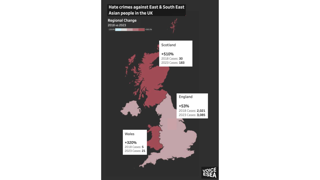
Mapping hate crimes against East and Southeast Asian (ESEA) communities in the UK
As a volunteer leading the data project in Voice ESEA, Shermaine Yung applies their years of experience in analytics to help the organisation understand and address challenges faced by the East and Southeast Asian community in the UK.
After having grown up in Hong Kong and Singapore, they have called London home for three years and counting. In this geovisualisation, Shermaine discusses Voice ESEA’s data collective which quantifies hate crimes against East and Southeast Asian (ESEA) communities and individuals in the UK. The primary goal is influencing policymaking and public support against these crimes.
What story does this visualisation tell?
"Eight in 10 police forces in the UK saw an increase in hate crimes against East and Southeast Asians during the COVID-19 pandemic, however this pattern is still a continuing problem post-pandemic.
"We created these visualisations to highlight to the public how prevalent these hate crimes are and how important it is to address these within society. Urgent attention is needed and change needs to be driven immediately."
Who was it created for?
"We created the map to communicate and highlight the pattern of hate crimes. These maps offer a deeper understanding of the extent and significance of this issue and address misconceptions people may have on the severity of this problem today.
"Our audience is broad. Our first target were educators, to facilitate discussions based on evidence and highlight the issues. We also wanted to make this data accessible to the public via spaces such as the British Museum.
"We want to enable top-down changes through decision making, policy and funding. Having a map like this means this data is clearly understandable and immediately demonstrates areas which urgently need resources and attention."
What methods did you use to collect and analyse the data?
"To obtain the data, we sent Freedom of Information (FOI) requests to 49 police forces across the UK. We wanted to understand when crimes occur and how often.
"Through analysing this data, we discovered the standard of data reporting varies hugely across police forces. This work highlights the need for better reporting standards to improve ongoing reporting and understanding of prevalence.
"The data also shows strong variations across the UK. The East and Southeast Asian community varies in size nationally and it is important to ensure that hate crimes aren’t buried within a national average, and areas like London or other cities with larger East and Southeast Asian populations can be explored in detail.
"Variations in the data highlight the urgent need for enhanced reporting nationwide, particularly to support smaller, more vulnerable populations of East and Southeast Asians in the UK."
Why did you choose to present the data in this way over other approaches?
"Using a map is intuitive and instantly situates people within their area and other areas of interest. It creates a level of familiarity with the visualisation which can help demonstrate that this trend of hate crimes is a problem that is happening around us.
"Hopefully, this can encourage people to take action if they can see how prevalent the problem is and their proximity to it.
"We also use colour scales in our maps which are very important in aiding map visualisations. Using colours like red can easily demonstrate the severity of the issue to viewers and can help identify patterns and changes."
What impact has the visualisation had in research, policy and other contexts?
"Through our work, various organisations have reached out to us to seek advice and collaborations.
"Our research has been spotlighted within media outlets such as ITV News and Channel 4 and corporations like Salesforce, where we’ve been able to speak about the impact of the COVID-19 pandemic on East and Southeast Asian hate crimes as well as the prevalence which continues today.
"On a research front, we've also worked with universities in the UK like the University of Bournemouth, University of Surrey and Royal Holloway, University of London, where we provide resources and our data to help them shape their teaching modules around East and Southeast Asian communities and hate crimes in the UK - further developing the relationship between their academic work and community activism.
"We’ve also offered advice to employers on how they can protect and support East and Southeast Asians in the workplace and help East and Southeast Asian employees feel comfortable and safe in in the workplace. This visualisation has helped facilitate this.
How else might this approach or data be used?
"There are so many possibilities of how we can expand this data project and research. There have been instances where organisations have reached out to us specifically for data and reporting.
"Our ability to support other organisations and is limited by data scarcity, accessibility and the lack of existing data standards.
"The work has shown that the lack of standards and scarcity of accessible data makes it difficult to understand the prevalence and impact of East and Southeast Asian hate crimes.
"Without strong data reporting practices, we won't be able to get accurate understandings of the prevalence. We hope to use this work to seek improvements and advocate for standardised data collection and reporting standards.
"Also, if we could access more data from the police, we could better understand the underlying factors that contribute to the prevalence of East and Southeast Asian hate crimes in certain areas. This would allow us to target action far more quickly and make the case for more resources."
What steps can others take to try this visualisation technique?
"We used Tableau Public, which is a free data visualisation software. This includes interactive filters which allow users to interact and engage with the data. Tableau Public has some inbuilt tools to visualise and georeference data.
"Data is key, so our advice is ensure that these are analysed and relevant to your visualisation."
What’s your one top tip for geographers looking to visualise data in this way?
"I would encourage geographers to ask themselves, ‘What is the issue that I need to focus my analysis on and the message that I want to convey?’
"Having a clear idea of your goals really helps in crafting your visualisation around the core message that you want to tell."