Dr Dianna Smith, Lecturer in GIS at the University of Southampton, created a geovisualisation showing the risks of child poverty across England. Here Dianna discusses why it was created, the data used to create it and how you can create something similar.
Explainer
What story does the visualisation tell?
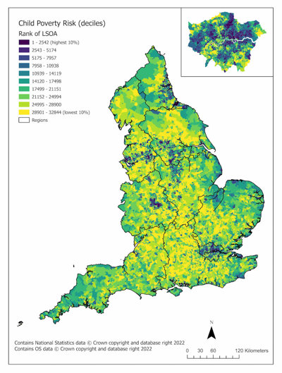
This image reflects the risk of child poverty across England, informed by our discussions with people working in food aid and local government. What we see here is a slightly different geography to other measures of poverty or deprivation, as it doesn’t just take income into account when considering the risk of child poverty in an area. We can clearly see how there are areas of higher risk in London and in the North, often in urban areas.
Why was it created?
We wanted to understand the spatial distribution of the risk of poverty for children across the country. We know a lot about deprivation generally - we are fortunate to have regular updates to the English Index of Multiple Deprivation (IMD), the most recent of which was in 2019. But what we don't always know is the detail of deprivation, and the different types of deprivation that impact on populations – this detail can be vital in devising interventions to address inequality that results from social and material deprivation, or poverty.
The Income Deprivation Affecting Children Index or IDACI score is heavily focused on income inequality, but we wanted to look beyond this. As part of research funded by Wessex NIHR Applied Research Collaboration, we set out to improve on small area measures of poverty risk. Here, we consider small areas as Lower Super Output Areas, which are approximately the size of small neighbourhoods; there are 32,844 across England.
We wanted to develop an indicator at the same spatial scale as the IMD score but that included factors beyond income that we know impact children. To find out what needed to be included in the indicator, we talked to people who work to support families experiencing social and material deprivation, such as coordinators of food banks and people working in local government teams to help families. We asked them what common factors were noticeable in the families seeking help and looked through published literature to see what kind of measures had been developed on the same topic, and what variables were included in these measures. Finally, we looked at what data were available that were up to date and represented the data we collected in interviews and through our scoping review of the literature.
Who was the intended audience?
Our main audience is people working in local authorities, specifically those who want to understand more about the spatial distribution of child poverty within their localities. We created these measures in collaboration with these colleagues, so we were able to develop something that works well for their needs. We can support their requirement to target resources and interventions, like the Holiday Activities Fund, where there is greatest demand.
What data did you use to create it and why?
We used a whole range open data, which is freely available and that reflected variables that are important in families experiencing child poverty. In total, we used seven variables combined into two separate domains. We brought these two domains together to create one overall measure of the risk of child poverty in an area. The data we used included income educational qualifications, benefits claimants and lone parents for the household composition factors. For the structural risk, we also included measures of childcare uptake within low-income families, households with no car available, and overcrowded households.
Once we standardised all this data and normalised it, much like you do for the Index of Multiple Deprivation, we had an overall measure. We then compared this with three different outcomes to see how much agreement there was between our measure and other factors we expect to be associated with childhood poverty. We validated our measure in this way while checking for correlation with the area ranks for IDACI, free school meal eligibility, and childhood obesity, and our data agreed well with these.
Why did you choose to present the data in this way over other approaches?
We chose to present our data as a map, with the data presented in deciles, because it's how the IMD score is usually presented. We wanted our key audience to be able to understand the results easily, so by presenting the data in a way which is familiar to them, we hope we can achieve this. Of course, we will also provide the data to anyone who asks, and would like to use it for mapping in their own local areas.
What impact has the visualisation had in research, policy or other contexts?
We haven't yet released this data widely, however, we have shared a similar risk measure for food poverty in small areas. This has been used by over 40 local authorities as part of their strategic planning, such as in Food Poverty Action Plans or in their annual Joint Strategic Needs Assessments.
We anticipate that the child poverty measures will be used in much the same way, as they provide a more specific type of measure for the risk of child poverty in across the country. Crucially, this data can be used as an overall index, or looking at one of the constituent domains such as household composition or structural risk. Focusing on one domain may allow the end user to consider specific types of interventions to best support their local populations. At a time when decisions around financial resources and targeting is the responsibility of local authorities, this type of information is extraordinarily valuable.
How have people engaged with the visualisation – what has it enabled people to do?
The mapping of this data allows people to focus in on areas within their localities that need to be targeted most for interventions around child poverty. As the data are available to anyone who needs to use it, people can create their own maps recategorising the data into local deciles rather than the national deciles that are displayed here.
How else might this approach or data be used? How can the visualisation be taken a step further?
It would be really interesting to create a timeseries visualisation of how the data change over time.
Try it yourself
If someone wanted to recreate a similar style of visualisation, how would they go about it?
The visualisation that Dianna created is a choropleth map done in a GIS package. But Dianna suggests that one of the main considerations for creating something similar is thinking about what data are relevant, their availability and whether they are at the right spatial scale or not, so that you can create an accurate geodemographic classification for an area.
In the UK, there are options to access a great deal of information and freely available data online. For example, the Department for Work and Pensions release counts of benefit claimants quarterly, or in some cases monthly. You can follow an established methodology for creating small area measures – Dianna recommends the technical guidance for the English indices of deprivation as a good place to start.
About the creator
Dr Dianna Smith is Lecturer in GIS at the University of Southampton. Her research interests are in quantitative health geography, and she uses GIS to visualise data collected or collated to address key social and spatial inequalities. Dianna works across the disciplines of geography and public health with links to local government, with a specific focus on food, diet and related health outcomes or behaviours.
You can find out more about Dianna on her University of Southampton profile or by following her on Twitter.
Featured image: Dr Dianna Smith