Jessica Baker, Technical Relationship Consultant at Ordnance Survey (OS), worked on a project offering colour blind accessible mapping as part of the OS Open Zoomstack product. Here she discusses why this was created, how people have engaged with this feature and shares some tips on how to make your own mapping as accessible as possible.
Explainer
What story does this visualisation tell?
The image, and the context behind it, is about pushing accessibility to the forefront of people’s minds when they’re making maps and other types of visualisations, such as charts and graphs.
In the UK, colour blindness affects around 1 in 12 men and 1 in 200 women. There are several different types of colour vision deficiency, the most common is people struggling to distinguish between reds and greens, but others find it hard to tell the difference between blue and yellow shades.
A lot of the time colour is an important aspect of map making and is often the primary element we use to distinguish different features, but it might not be something people think about with regards to accessibility. For example, red to green colour scales are often used to show bad to good trends in data - maps showing the poverty rate of a country may have a red to green scale for instance. For someone with red-green colour blindness this makes the information presented hard to interpret.
We made two accessible styles for the OS Open Zoomstack product, which aim to help the majority of colour blind people (but we know this won’t be perfect for everyone). What we were trying to do with this project is highlight the importance of accessibility and make people in the industry aware of it. With OS being the national mapping agency for the UK, we’re in a good position to be championing these messages.
Why was it created?
When I joined OS two years ago, colour blindness accessibility was in the back of people’s minds in the department that I joined, and now work in, and I picked it up as a project. It was more to see what was feasible to do - I had a play around with colours, contrasts and shades for different features and found what worked well. We knew this would have positive impacts and benefits for those who need this feature when using maps, so we developed it further from there.
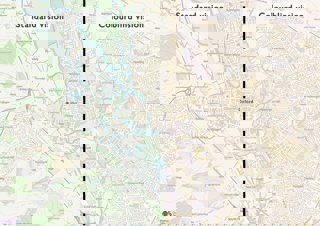
When we talk about colour blind friendly mapping, I often think people think we’re talking about our paper maps and that we’ve made different versions of those! But we’re not quite there yet. We are striving to roll this out more widely though. So far, we have done this with the OS Open Zoomstack product, which is a completely free, open source data set and is really popular. But we’re keen to expand this into our other products too such as the OS maps app, which people use for walking and cycling.
Who was the intended audience?
The Zoomstack product that we created these original colour blind friendly styles for is something that is meant to be used in GIS software, so it is often used by quite a technical audience, such as local councils and others using OS data. We’ve tried to tailor it to this audience, but we also wanted to make it accessible to the public, so we also created an interactive web map using the data. This is really intuitive and is quite similar to the Google Maps interface – people can use it to see their local area or an area that they are planning to visit without needing to download lots of data.
We also worked with those in the education sector when we were developing the style sheets, including a charity called Colour Blind Awareness, who ran a campaign last year to highlight that there is, on average, one colour blind student in every classroom across the country. Often, colour blind students will struggle with the colour scales that their teachers are using, especially in geography lessons where maps and map reading are important! There’s not much in the way of alternatives for students with colour blindness, and we’re hoping to get alternative map extracts ready for exams in the near future. We’ve also created workshops too to help teachers incorporate these in their classes with students.
How did you create it?
We used the Zoomstack product first because it’s quite easy to manipulate and edit.
We wanted to make sure the maps were still recognisable – people are used to seeing blue for water, green for vegetation etc., so we wanted to keep this theme instead of making them incredibly psychedelic! That way people who didn’t have colour blindness could also still use them if they wanted to.
We used a gradual process to change the contrast of the different features. In Zoomstack there are plenty of greenspace features such as woodland, national parks, private gardens etc., that are different shades of green. For someone who is colour blind these green shades make it difficult to distinguish between these features, so we worked to make these shades darker and clearer. We also focused on waterways and motorways because they’re both blue on our maps - and we don’t want anyone to be confusing the two of them!
As a non-colour blind person I had to use a lot of screen simulations to get this right and I worked a lot with colleagues who are colour blind to help guide me on what was working for them. Buildings were another feature they picked out, so I also made those features darker and text labelling black so that it stands out a bit more - it’s all about getting the contrast and the order of layers on the map right.
How have people engaged with this work – what has it enabled people to do?
We posted these out on Twitter and asked for feedback on whether people thought different features were clearer and what we received back was overwhelmingly positive! It’s good to know that our work has been useful for people. A lot of feedback came from colour blind GIS analysts who use Zoomstack and would usually have to adjust the colours themselves. Now we have provided these style sheets, which is an extra data file, this has saved them a lot of time.
Teachers have found the web map really useful for lessons as well, and students with colour blindness have said that the buildings and other features stand out more for them. We’ve also had feedback saying that we should now roll this out to our other products – we’re currently investigating how we can take this forward and translate the colour vision deficiency styles to other OS datasets.
This project also won a Geography in Government Award in 2020, which was amazing and it’s great that it was recognised for the impact it’s having.
How else might this approach be used? How can it be taken a step further?
I have done numerous talks on the principles of good map making and how to make cartographic designs more accessible for people with colour blindness. I think that is where there is scope to increase the industry’s awareness of this and pushing for people to think about it when they’re creating maps. Are they putting their work through a colour blind simulator for example? Are they adding other elements into the map so that features aren’t just relying on colour, for instance having symbols and dotted and dashed lines to show different features?
We’re trying to push this out with our other products at OS, but we also want to build on this knowledge with other organisations and share principles and tips for increasing accessibility.
Try it yourself
Do you have any tips if someone wanted to create something similar, or be more aware of accessibility issues in their maps?
Jess recommends the following tips to help make your map or visualisation as accessible as possible:
-
Use more than just colour to determine what a feature is - change the weight or style of lines, add labels. If you’re doing something more interactive like a web-based map, then using call outs is a good idea.
-
Use different websites online to check for accessibility - Colour Brewer is good for creating accessible colour palettes based on how many classes of data you have. She also recommends the Adobe accessibility checker on Adobe Color for checking colours are well contrasted.
-
Jess also recommends Zoomstack for another user-friendly option for changing colours to suit your needs as every feature is a separate layer in the software.
About the creator
Jessica Baker is Technical Relationship Consultant at Ordnance Survey (OS). Prior to this she was on the OS Graduate Development Programme when her work on colour blind accessible mapping won the Contribution to the Profession category in the Geography in Government Awards in November 2020.
You can follow Jess on Twitter at @GeospatialJess.