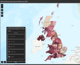
Dr Megan Blake, Dr Adam Whitworth, both University of Sheffield, and Dr Angelo Moretti, Manchester Metropolitan University, created this visualisation, in collaboration with the Food Foundation, which illustrates UK-wide estimates of adult food insecurity at the local authority level. Here, Megan explains why the visualisation was created, its impact, and how this approach can be taken further in the future.
Explainer
What story does this visualisation tell?
The visualisation has three interlinking parts. Firstly, this acts as proof of concept. It demonstrates what we thought would be there – that food insecurity is variably present across the country - but had not, until this point, been able to prove because the data that was previously available was not consistent or geocoded beyond the level of region. It also demonstrates that food insecurity is a geographical problem and that the way that people’s foodscapes are configured is linked to producing that geographic variability.
Secondly, the visualisation and data show that food insecurity runs deeper than merely financial inequalities. The data doesn’t map exactly on to the index of multiple deprivation, although that is one of the predictor variables, there are other factors at play - it’s also about how people concentrate into places and what resources are available in those places.
Finally, it shows that the need for support extends beyond what food banks currently offer. Food banks target people who are hungry and in deep financial need. If you’re outside of these criteria, but are still worried or struggling with food security there’s not much support there. The three measures we’ve used in the visualisation - hungry, worried and struggling - really help to expand our understanding around the sorts of interventions that are needed to repair those foodscapes.
Why was it created?
It was a combination of on the ground need and opportunity that brought this about. Myself, Angelo and Adam were discussing doing this work when an opportunity arose from the Voluntary and Community Services Emergency Partnership - Food task and finish group, which I have been involved with for the past year. This is a group of approximately 40 national charitable organisations and local government associations who are looking at food. They wanted some data to help them better understand the scale of the food security issue and to be able to start to plan to do something about it.
We spoke to the Food Foundation who had been running nationally representative surveys throughout the pandemic. They had not been geocoding responses at local authority scale, but they did this for us and so this was how we obtained the survey data.
The map has enabled people to see the scale of the problem where they are, including politicians, so it’s a great awareness raising tool and for communicating the problem to different stakeholders, like Local Authorities. After all, if you can’t see the problem, it’s very easy to think it doesn’t exist.
Who was the intended audience? What other audiences might be interested?
As this was a request from the Voluntary and Community Services Emergency Response they were our main audience, but we went to great effort to engage the media so that this could be seen more widely by the general public and national policy makers. Part of the reason why we wanted practical data was so that it could be used to persuade government that this is something of national concern.
We had a number of news articles in the Guardian, Bloomberg, Radio 4, Sky covered it on their website, it also got a lot of pick up from local radio and newspapers too. There was also interest from Public Health England, as food and health concerns are of course linked, and the Local Government Association who are preparing a local campaign around food security. We’ve also been contacted by the library of The House of Lords.
What data and techniques did you use to create this and why?
We used existing government data and combined it with survey data from the Food Foundation, collected in January 2021. We took a local area estimation approach to get local area estimates using the 4,000 responses from the survey to predict each local authority's outcome estimate, based on the characteristics of the area and the statistical relationship between each characteristic and the outcome. The three estimates that we made are based on different combinations of questions – the three measures are not exclusive, so for example, everyone in the hungry group is also either in the worried or struggling group. There’s some overlap between the worried and struggling group too.
Adam and Angelo also constrained the local estimates to known regional values so that we’re confident the outputs of the model are realistic - if you add up all the estimations in the local areas of a region, they equal the total values for the region.
Why did you choose to present the data this way over other approaches?
We wanted to show the geography! We do also have the data as a table but it’s the visualisation that really grabs people. It’s not just a flat map, it’s zoomable so that users can see both the national pattern and the pattern in the place where they live.
We wanted to show the multiplicity and multidimensionality of food security. The worry speaks to the stress and mental load that people experience, whilst the struggle moves beyond just being hungry and incorporates the struggle of obtaining food in daily life that people encounter in the place where they live. This emphasises geography as both the context within which this hunger, worry and struggle occurs, but also as an active contributor to people’s food insecurity.
We could have done the analysis using United States Department of Agriculture (USDA) questions in the survey and constructed the USDA’s calculation for food insecurity, but there’s a bias towards income in the way that the data is collected with this method. This is partly because there is an assumption that food insecurity in wealthy countries is down to poverty only, but this is not the case. It’s also about having a supermarket or place to buy healthy food in the area you live without having to travel a distance for it - it’s about not having to go through that extra difficulty to obtain food. It is also about having the knowledge, know-how and physical capability and mental capacity to utilise food.
What impact has the visualisation had in research, policy or other contexts?
It’s given people a tool to start the conversation and it can be pointed to as evidence that this is a problem across the UK. I think previously people were quite resistant to this conversation and would shut the topic down if it came up – this research and the visualisation offers a way into that conversation.
I’m also interested in the mental health and wellbeing relationship connected to food security. We don’t have enough mental health support in this country, and we know that those who are food insecure are depressed, anxious and isolated and so we need those community interventions – money alone won’t solve the problem.
The other reason for food insecurity is capability issues. We know that those who are disabled are much more vulnerable compared to others, and it’s about ensuring that the policy response is nuanced and cuts across multiple government departments - they all have something that they need to do. This work allows us to say that there are areas of food insecurity that are within the remit of numerous departments.
What we need are interventions that help people reconnect with food, rebuild knowledges around food and do that in a way that does not stigmatise those that need support.
How have people engaged with the visualisation – what has it enabled people to do?
There’s been some interesting reactions to it and mentions by politicians. A lot of peoples’ immediate thoughts were ‘but Wickham’s posh?!’ or ‘I thought we were worse than that!’ – there have been some surprises for people in terms of where they think there is or isn’t a food security problem. At the end of the day, we’re a wealthy country and no-one should be hungry - the fact that there is hunger everywhere in the UK doesn’t mean that people are off the hook, it is not a competition to be the worst!
At local authority scale, I speak to food boards in various areas such as Wickham and Waltham Forest (London) to discuss what they are doing, ways forward and how to address the wider issue beyond the demand for food banks.
So, the visualisation has raised awareness, but the actual change, at least at a national scale, has yet to happen. I think for me one obvious change would be to get the Family Resources Survey data more regularly available at a smaller scale. I also think that we need to maintain the universal credit uplift. I would also like to see greater attention to supporting local interventions, which would mean more money to councils.
How else might this approach or data be used? How could it be taken a step further?
This analysis was done during the pandemic so, with consistent data over time, we could track changes on how much of the food insecurity captured by the data was pandemic related.
Other analysis we are planning with this data include showing links with policy and health data – are there causal relationships and can we predict vulnerability to a greater extent? We think of food insecurity as an urban problem, but there is a rural aspect to it too. There’s also work to be done around food deserts.
Try it yourself
If someone wanted to create a similar style of visualisation or analysis, how would they go about doing it?
Megan highlights that it matters for research and projects to be useful and more than simply an academic exercise. In order for your work to have impact you need to spend time on your relationships and networks so that you create something that people need, want and can understand. She also recommends working with people who have skills that you don’t in order to achieve this – for example, this project would not have happened without the whole team of Megan, Adam and Angelo.
You can find out more about the analysis the team used in the project briefing report.
About the creators
Dr Megan Blake is a Senior Lecturer in the Department of Geography at the University of Sheffield. She is an expert in food security and food justice with her research focusing on surplus food chains and practices of redistribution, community organisations, social innovation and self-organisation, and practices of resilience, and social inequalities.
You can find out more about her work on her university profile.
Dr Adam Whitworth is a Senior Lecturer in Human Geography at the University of Sheffield. He is interested in theoretically-informed applied research into the spatial organisation of employment support policy. Adam is a mixed methods researcher who has experience of qualitative methods and GIS as well as extensive quantitative and statistical skills with large and complex data.
You can find out more about his work on his university profile.
Dr. Angelo Moretti is a Lecturer in the Faculty of Science and Engineering at Manchester Metropolitan University. His research interests span topics related to survey statistics, survey methodology and statistical modelling, with his main area of expertise being in small area estimation under mixed-effect models. He is also interested in applications related to social indicators, such as crime, wellbeing and poverty indicators.
You can find out more about Angelo’s work on his university profile.
The Food Foundation is a registered charity whose mission is changing food policy and business practice to ensure everyone, across our nations, can afford and access a healthy diet. They do this working in partnership with researchers, campaigners, community bodies, industry, government and citizens to galvanise the UK’s diverse agents of change.
You can find out more about the Food Foundation on their website.
You can find out more about this project in the team’s briefing report.