
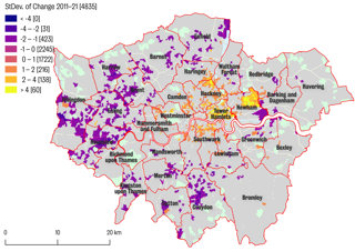
Dr Jonathan Reades, Senior Lecturer in Quantitative Human Geography at King's College London, created a visualisation using data science and machine learning methods to predict demographic change throughout London by 2021. Watch the videos below to learn why he created the visualisation, the methods he used and how you can have a go yourself.
Gentrification in London (c) Dr Jonathan Reades
Explainer
In this video, Jonathan discusses the story that this visualisation tells including why he chose to take a quantitative approach towards the issue of gentrification, the data that he used to create this map, and the impact it has had on research into this issue.
"There is a point where, if we want to move into prediction, then we need to turn to a different set of methods… and that’s where Machine Learning comes in."
Try it yourself
Here Jonathan discusses the data he used to create the map and how you can have a go too. He also talks about how this approach and data could be taken further and extended.
“This is how I learned to code in the first place: finding code that did something I was interested in and stepping through it line by line… breaking things until I really understood what it was doing."
About the creator
Dr Jonathan Reades is Senior Lecturer in Quantitative Human Geography at King's College London. He often describes himself as being at the computer science end of geography - a really exciting area where the coding skills of big data and data science are brought together with the critical tradition of geography.
Jonathan's research draws on geographical theory and quantitative social science methods to address contemporary challenges in urban and regional development.
You can find out more about Jonathan and his work on his website and by following him on Twitter @jreades.