What story does this visualisation tell?
Our interactive visualisation shows which neighbourhoods across the UK are most vulnerable to food insecurity during the ongoing cost of living crisis according to our Priority Places for Food Index, developed in partnership between the Consumer Data Research Centre (CDRC) at the University of Leeds and the consumer rights group Which?.
The Index highlights indicators that can prevent people from purchasing food, or that cause a lack of availability of cheap food in the local area.
Why was it created?
We created the Index and map to encourage action to support places most in need. Both the Government and supermarket retailers have a role to play in ensuring availability of affordable and nutritious food while also ensuring that individuals have the means to access it. More information can be found in Which?’s affordable food for all campaign.
Who was the intended audience?
Our primary audiences were local and national governments and supermarket retailers, who we hoped would welcome a tool to help prioritise where additional support was most needed.
We’ve been delighted to see interest not only from these audiences but also from charities and even individual consumers who are interested in how their neighbourhood fairs in comparison to others according to the Index.
What data did you use to create it and why?
The Priority Places for Food Index was constructed using open data across seven domains relating to food insecurity in the UK, available as an open dataset on the CDRC Data Portal.
We combined several indicators we believed to be proxies for vulnerability to increases in the cost of living into a single composite index. The indicators were grouped into seven domains: proximity to supermarket retail facilities, accessibility to supermarket retail facilities, access to online deliveries, proximity to non-supermarket retail facilities, socio-economic barriers, fuel poverty and family food support. The first four of these domains captured the availability of food for neighbourhoods, and the last three captured the ability for neighbourhoods to purchase this food. In building the composite index, we weighted these two types of domains equally, leading to our final weighted index.
Why did you choose to present the data in this way over other approaches?
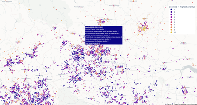
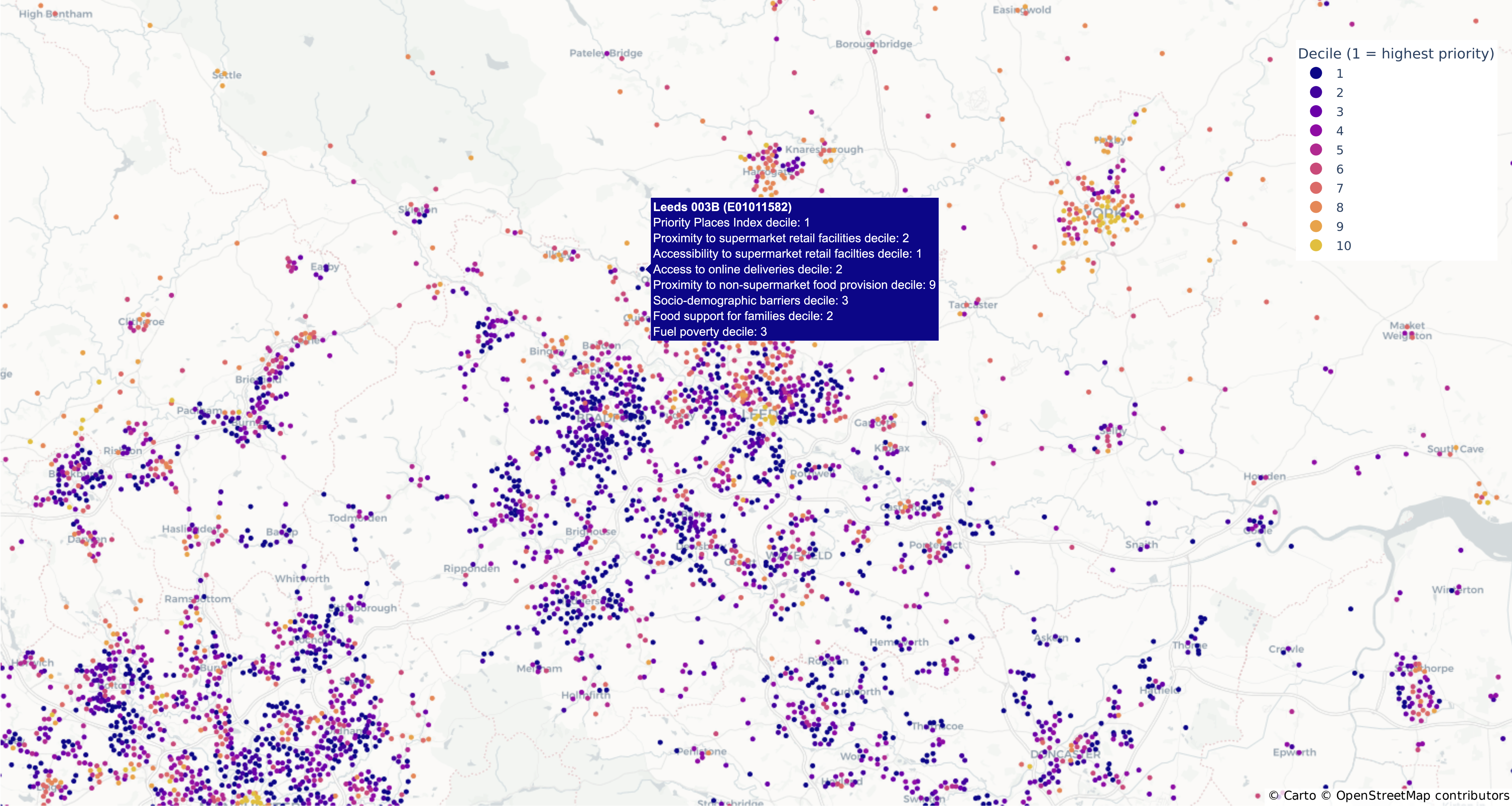
Upon loading, the map is centred on Leeds and consists of dark blue points representing the highest priority places. Neighbourhoods are plotted as points so each is equally represented. Hovering over one of the points gives information on the domain score of the neighbourhood so the user can understand why a particular neighbourhood has been identified as a priority place. We also added a toggle switch which plots supermarket locations to give a more fine-grained view of supermarket accessibility. The hover-over menu for these supermarket points shows the retailer and an indication of store size to further support the user in understanding the food environment at the local level.
One important thing to bear in mind when using the tool is that the Index is for each of the four nations in the UK separately due to slight variations in some of the underlying data sources. The 10 percent highest priority areas are not necessarily the top 10 percent in the UK overall. Because of this, it’s also not possible to compare neighbourhoods across countries, only within countries.
What impact has the visualisation had in research, policy, or other contexts?
Following a high-profile launch in November 2022, with coverage in The Times, The Guardian, Good Morning Britain and BBC Panorama, we had over 3.5k users in the first month. There has been interest in the tool from individual government departments, particularly those responding to public health crises, economic crises, and the Levelling Up agenda. We are already working with stakeholders in national and local governments to explore policy changes that can be made as a result of what the Index has revealed.
The campaign launched by Which? focuses on retailers and the role that they must play in supporting priority places. Impacts anticipated in the retail sector are centred on improved health and wellbeing of customers through access to cheaper and healthier food, for example through budget lines and more targeted promotions. The suggested impacts are laid out in Which?’s ten-point action plan. Since the launch of the Index and campaign, supermarket Aldi has committed to Which?’s plan and has called on other retailers to do the same.
How have people engaged with the visualisation?
The visualisation shows the areas of the highest need and the reasons for this need. There may be high priority places with good access to food sources, which are ranked as a priority place due to socio-demographic barriers. Likewise, there may be areas with few socio-demographic barriers, but with limited sources of cheap food. This means both policymakers and retailers are needed to provide support in areas of high need. The Index also helps third sector organisations, such as outreach groups and food redistribution companies, to target support. The Index was built for diverse stakeholders to engage with the visualisation, and in turn for changes to occur across the food system, from production to consumption, and across socio-demographic areas.
If someone wanted to recreate a similar style of visualisation, how would they go about it?
The Priority Places for Food Index data at the domain level is available on the CDRC Data portal, along with a variety of other data sources contributing to the index, as linked above.
We used the open source plotly and dash libraries in Python for our visualisation and web-app development. Our web application is hosted on the cloud via a Docker container. Docker allows us to define all the dependencies required for the application to run and supports portability of the application across different hosting services. The use of cloud hosting services such as Microsoft Azure provides automatic scaling and makes it easy to build automated deployment pipelines that support continuous improvement and development of the visualisation.
How can the visualisation be taken a step further?
We are keen to continue development of our Index and the associated visualisation. We plan to incorporate more data sources as they become available, for example the latest Census data. We would like to think more broadly about other indicators and novel data sources, for example individual- or neighbourhood-level financial data. We plan to produce an annual update to the index each autumn, in time for increased financial pressures due to energy costs. Finally, we are keen to hear from any stakeholders who might have a relevant data source that they feel should be incorporated.
About the creators
Peter Baudains leads the Research Data Science team at the Consumer Data Research Centre at the University of Leeds. He received his PhD from UCL in 2015 and brings to CDRC over five years of experience in industry. He has research interests in building data-driven models of human behaviour and leads CDRC's workstream on developing derived data products for open use.
Fran Pontin is a Research Data Scientist in the Consumer Data Research Centre, having joined the team in 2022. She was previously an ESRC funded Data Analytics and Society PhD student in the school of Geography and Leeds Institute for Data Analytics. Her PhD research explored the relationship between the built environment and levels of physical activity and sedentary behaviour utilising smartphone data. She also works with Dr Michelle Morris as part of the Nutrition and Lifestyle Analytics team within CDRC, leading projects with supermarket retailers.
Emily Ennis is the Research and Impact Manager for the Consumer Data Research Centre. She oversees all research and impact in the Centre, helping researchers and their projects tackle real-world problems and have real-world impacts. She was an academic researcher until 2018 before moving into research support. She has been in post at CDRC since November 2020. While she works across all research themes at CDRC, she has most recently led award-winning work on food carbon footprints in collaboration with Leeds City Council, and works with Dr Michelle Morris and her team on research with food retailers.
Michelle Morris is an Associate Professor and Turing Fellow based in the Leeds Institute for Data Analytics and School of Medicine at the University of Leeds. She leads the Nutrition and Lifestyle Analytics team. Her interdisciplinary research uses novel forms of data, including supermarket transaction records, for research into lifestyle behaviours and health. She is a co-investigator at the Consumer Data Research Centre and leads the research on the IGD’s Healthy and Sustainable Diets programme evaluation.