Benjamin Hennig created this visualisation which shows the Earth’s surface resized by its human population. Here he discusses why he created it, the data and techniques used and the impact it could have in science communication spheres.
Explainer
What story does this visualisation tell?
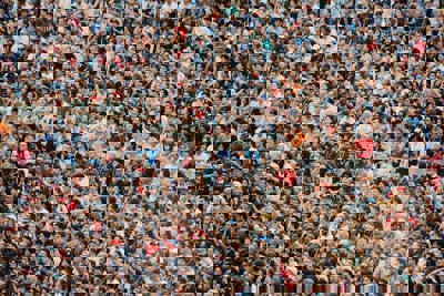
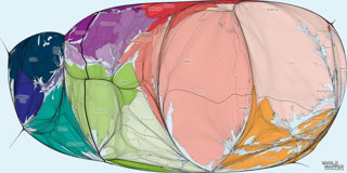
We are living in the Anthropocene – the age of humankind. This map shows our planet from the perspective of people and how it would look if Earth was shaped to give every single human being on this planet an equal amount of space. About 95% of the world’s population live on only 10% of the landmass; land itself accounts for just under 30% of the planet’s surface. As a result of that, the maps that we are used to – and even a cartographically more accurate globe – make those spaces of humankind almost invisible.
This map shows the real shape of humankind. The planet’s surface is split into small grid cells which are then resized to be proportional to the number of people who live there. This almost egg-shaped representation shows the continents cramped together with small parts of the sea only visible in this depiction as tiny blue lakes between them. Deserts and mountain regions almost disappear. The four traditional physical hemispheres, dividing the world into north, south, east, and west, become almost irrelevant and are replaced here by a new division.
The population centre of the world is to be found in the middle of this map, situated on top of a mountain next to the Tiger Lake (Badai Talai) near the city of Udaipur, India - the current centre of gravity of the world’s population. As the world’s populations change, this global population centre is gradually shifting from the currently most populated region in Asia towards a rapidly growing African continent, which pushes the significance of Europe and the Americas literally towards the edges of the planet in this modern version of a mappa mundi.
Why was it created?
The idea for this map came during research on my PhD project where I explored the capabilities of cartogram techniques to become more versatile and suitable for being alternative forms of conventional map projections. As part of this, I started working with gridded datasets as these provided the complexity of data that I needed to improve on existing cartogram approaches. While in my project I mainly focused on land areas, it was a more serendipitous idea to test the approaches that I had developed over the entire planet’s surface and see what comes out of it.
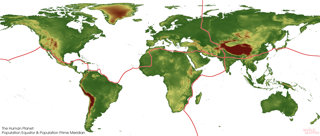
It was initially a merely experimental exercise which turned out to look so intriguing that I spent some more time and effort into improving its visual appearance and conducting further analyses, such as modelling a hypothetical ‘Population Equator’ and a ‘Population Prime Meridian’ (see below) that shows how these human dimensions are reflected in our ‘normal’ or physical world view.
Who was the intended audience? What other audiences might be interested?
The original audience of this map were my PhD supervisors and examiners – or more generally speaking, an academic audience who might read my PhD thesis. Though I quickly worked out that there is more to this map than it just being a conceptual academic shenanigan or a geeky technical GIS exercise!
At its core this map resembled to me what medieval mappae mundi were showing, which are rather distorted and biased depictions of our world (which this map is as well: to begin with, it was created starting with a Euro-centric world view). I liked this narrative as it helps us understand the human shape of the planet and how some regions of the world are much more important from that perspective than we perceive them to be. In combination with defining the population centre of the world, I thought this contains a compelling narrative not only to talk about mapping, but also about humanity, inequality, and all the human dimensions that make our planet as much as its physical dimensions. Therefore, the audience that I use it with most often is the general public in lectures and talks, but also in outreach materials and other forms of science communication.
What data and techniques/approach did you use to create it and why?
The original dataset I worked with for this map is a very important one - the Gridded Population of the World - a dataset published by the Socioeconomic Data and Applications Center (SEDAC). It was first started in 1995 as the first comprehensive effort to model the distribution of human population on a continuous global raster surface – something essential not only in advancing social sciences, but even more so in climate change research. In this version of the map, I used the fourth version of this data (GPWv4) at a 0.25 degree resolution.
The technical side of the work was done in GIS, containing several steps of data pre-processing to make the population raster fit to be transformed using a density-equalising cartogram algorithm. I call these types of maps gridded cartograms and the development of the underlying approach was one of the key parts of my PhD research. The final step was then the visualisation, for which I use graphic design software.
What impact could the visualisation have in research, policy or other contexts?
This particular visualisation is probably best placed in science communication to make people curious about what it shows and to engage them with the accompanying narratives around the human dimension of our world. Yet in a wider sense, gridded and other forms of cartograms are very useful in a wide range of applications. In research, cartograms have become a more established form of visualising data that requires other spatial dimensions than the physical space to be put in the centre; in some parts of the media (especially in the UK) have started using forms of cartograms to visualise election results; in schools cartograms are well established to teach topics ranging from global inequalities to climate change; and in a policy context cartograms can provide valuable alternative views of geographic realities where images are so much more powerful than words, tables or complicated charts.
Why did you choose to present the data in this way over other approaches?
The type of visualisation was very much defined by my research. I have worked with other cartogram approaches for population data, yet for this feature I selected this particular display of the data for its unusual and perhaps also slightly artistic appearance – after all cartography is often described as the art and science of making maps.
How have people engaged with the visualisation – what has it enabled people to do?
From my experience in using this map in different outreach activities, I can say that this map has always proven to easily attract people’s attention. It was, for example, part of a digital display at the Talking Maps exhibition in Oxford’s Bodleian Libraries where visitors could explore a wide range of cartograms, and this was one of the most popular ones that people engaged with. I have also printed different cartograms on postcards, and this is always a very popular one, I assume for its also somewhat artistic appeal. This shows that a thought-provoking image can be a good conversation starter to talk about the underlying issues that the image represents.
How else might this approach or data be used? How can the visualisation/data be taken a step further?
Cartograms are by no means a new type of map. They have existed since the 19th century where many of our contemporary cartographic methods were invented. But digital technology has been a game changer in being able to create such types of maps - in the past two decades we have seen ever more advanced algorithms being developed that allow us to use the equally growing amounts of data to be processed with mind-twisting visualisation techniques. I personally would like to see cartograms in general become more normal types of map depictions that are no longer seen as unusual, but which will be read just like other types of maps. When they are more common, then we can really start to utilise these advances and create more visualisations that help us make sense of this jungle of data.
Try it yourself
If someone wanted to recreate a similar style of visualisation or analysis, how would they go about it?
Ben advises that a good starting point in map making is always learning GIS in the first place. Whether you have access to a commercial platform such as ArcGIS or whether you use QGIS does not really matter. The underlying concepts are the same. Getting a feel for geographic data is essential, and in order to become more creative with geographic visualisations an understanding of the nature of data is also important.
Producing cartograms is not rocket science, but current GIS software does not make it completely straight forward either. On the Worldmapper FAQ page there is a list of some of the tools that might be good starting points, but many other tools and techniques exist and a query in your search engine of choice will help you to find suitable tools for the type of cartogram that you want to do.
Last but not least, Ben recommends taking a look at Michael Gastner, the co-author of one of the defining cartogram algorithms in recent decades, who has published a new online cartogram tool that helps you to create your own cartogram through an interactive online interface. This does not make a map like the one shown here possible, but it goes a long way in making your own first steps in the cartogram world even without and GIS knowledge.
About the creator
Ben Hennig is a Professor of Geography at the University of Iceland and an Honorary Research Associate at the University of Oxford. His research interests are in social and spatial inequalities, humanity’s impact on Earth, global sustainability and the development of concepts for analysing, visualising and mapping these issues. He is also involved in the Worldmapper project.
You can follow Ben on Twitter at @geoviews and find some of his work on his blog and the Worldmapper Project’s website.