
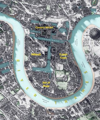
Owen Powell, Senior Consultant at Arup, created this visualisation of the Isle of Dogs in London using aerial lidar which he has turned into a 3D model. Here he discusses why he created the visualisation, the technique he used and how you can create something similar.
Explainer
What story does this visualisation tell?
This map visualises a Digital Surface Model (DSM) derived from aerial lidar, which is a laser scan that I have turned into a 3D model. I’m obsessed with how water shapes and dominates the landscape, and the juxtaposition of rivers with man-made waterways such as canals and docks. The Isle of Dogs is fascinating with its bold meander surrounding land that has been carved up by docks and wharves over the years.
Why was it created?
For no particular reason other than I love making maps and I felt it needed to exist!
A few years ago the government embraced the open data movement, and a huge resource of mapping data has been made freely available. I feel like a child in a sweet shop when I consider the wealth of information that is out there and the potential it has, like energy. It's like the government giving away free hardwood, to a carpenter - not to use it would be a crime! Of course the beauty of open data is that it has been collected for a specific reason, but it has so much value.
Each time I create something I try and do something different, like pieces of art that exist in their own right, made with care and attention to small details that convey emotion. So with open data comes this burden, a duty to use it. I feel like I could make something with it forever, particularly as it gets more detailed and regular. As a result, I feel like I should share my work and how it is made. There is also an element of research in these mini projects that I will use in my job, where I try out new techniques and experiment with tools and new data.
Who was the intended audience? What other audiences might be interested?
The intended audience is people that are interested in cartography, and different approaches to a long standing tradition of visualising places. Besides mapmakers and 3D artists, then anyone who might be interested!
What data and technique/approach did you use to create it and why?
The map was made using open data (Environment Agency 50cm Digital Surface Model, Ordnance Survey OS Open Zoomstack) and a technique I have developed using Blender (3D modelling and animation) and FME (data transformation) software. Using a function in Blender called micro-displacement a 3D surface is made using the DSM data, which is then rendered using ray traced lighting, creating a hyperreal version of the landscape.
I also blend different topographic layers of OS data to control the colour, surface texture and material. For example, the Thames is layered to have a flattening effect on the 3D model, which both emphasises it and allows the surrounding land to stand out.
Why did you choose to present the data in this way over other approaches?
The VFX and games industry is at the forefront of 3D graphics, where environments are becoming massively detailed, at an almost unlimited level. A lot of this is a delicate balance between models at different levels of detail (LOD), and high resolution imagery that gives the appearance of detail. 3D software such as Blender provides the richness and high resolution that it lacking in mainstream GIS, although the trade-off is a lack of interoperability.
I really do believe this is the future of cartography - the applications for creating maps as detailed as you wish will lead to massive transformation in the geospatial industry. You only need to look at the work being done by Epic Games with Unreal Engine 5 to see the potential.
How have people engaged with the visualisation – what has it enabled people to do?
I've had a great response to sharing my work online, and how I make it. I would hope that it would encourage people to question the norm and look outside the usual industry methods of visualising geographic data. It also allows people to reconnect with places or see them in a different light.
Try it yourself
You can find some tutorial videos on Owen’s website. Otherwise Owen says there is a wealth of other Blender Cartography tutorials online. You can find geographic open data from Defra, Natural Resources Wales, The Scottish Government and Ordnance Survey.
About the creator
Owen Powell is a Senior Consultant in Arup’s Infrastructure group. He specialises in spatial data management and analysis with a focus on visual communication.
You can find out more about Owen and his work on his website, in his career profile on our website or follow him on Twitter @owenjpowell.