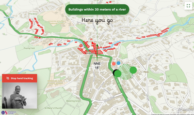
What if you could make a phone gesture with your hand and ask your map to show you things such as ‘buildings within 20 meters of a river’ or ‘pubs that are close to the train station’?
Steve Attewell, User Experience Practice Lead at Ordnance Survey, has created an experimental map control system that uses hand gestures, voice recognition and artificial intelligence. Here Steve discusses the different aspects of the project, why it was created and the use of AI within a geospatial context.
Why was the visualisation created?
This visualisation is an investigation into how you get very complex data onto a map using speech and gestures. It's often very difficult to get information from a geospatial data store onto a map and this should be easy for people.
The main part of the demo is where a user asks for data with words and hand movements. With the advent of the new large language artificial intelligence models like ChatGPT, I experimented on whether they would be able to assist in translating from normal human language into retrieving data out of a database, and then processing it in a way which it can be visualised.
In the demo this can be seen by asking for ‘walking paths’, which is then translated into visualising all the walking paths on that specific area of the map.
The other part is the gesture recognition. As a user experience designer, I was watching the advent of the new Apple Vision Pro headset, and the Meta Quest headset, which are moving toward controlling interfaces using speech and gestures. I’m interested in what's it going to be like in 5-10 years as we'll be seeing more interfaces with hand tracking come into daily life now that it's possible to track hands quite accurately through a standard camera. I've wanted to have a play with something like this for a while to see how practical it is and to learn more about the interaction design considerations of these technologies.
Who was the intended audience?
I want to make Ordnance Survey data easier to access for all our public sector customers. They get access to Ordnance Survey data under the (PSGA), but if you don’t have in house geospatial skills, often you have to go to a third party which turns into a project. Wouldn't it be nice if you could ask a map to show you some things that are available relevant to your plan or investigation?
What data did you use to create it and why?
What you see here is a culmination of experiments using s ChatGPT, data, mapping data, hand tracking and browser-based voice recognition. I used OpenStreetMap data because that’s more freely available, and therefore if I want to make some of my code freely available, then people can use that at no cost, and they can play around with it. I also have other experiments that use AI to make Ordnance Survey’s National Geographic database easier to interact with.
How did you use the data, what methods, and techniques?
I started out with ChatGPT, showing it some data and asking it to write queries as I wanted to get a sense of what it might be able to do with a big store of data. Then I investigated the APIs that are available at OpenAI. If you're a developer of any kind, whether you use Python or you develop web apps with JavaScript, you can start building things which are a kind of call and response. I then spent hours upon hours refining prompts, seeing what it can do, and poking to see the best way to get it to give you just a comma separated list without a load of exposition around it.
Why did you choose to present the data in this way over other approaches?
In the video demonstration there's a fair bit of interaction design and deliberate exposing of feedback, highlighting that it is less about visualising the specific data and more about enabling somebody to understand what’s happening in that moment. In terms of the gesture recognition, being able to see my hand on screen is quite an important thing as all of those little interactions and gestures are really carefully designed to show you what's happening at that exact moment in time. The gestures however may not be that intuitive to use if you use it for the first time, but once you practice, you can navigate around the map really, really quickly.
What impact has the visualisation had in research policy or any other context?
People can see a tangible example of what we mean by using large language models within a geospatial context. They are words people talk about a lot, but there are very few examples where you can actually see them tangibly working in front of you. This tool is generating a lot of conversations. People are asking lots of questions about what can and can't be done, what's possible now and what might be possible in the future. It’s done exactly what I hoped it would: provide a good example of the tangibility of using large language models within a geospatial context and generating more informed conversation.
About the creator
I am the User Experience Practice Lead at Ordnance Survey, Britain's mapping agency. I manage a team of User Experience (UX) and User Interface designers who design, test, and build web interfaces and geospatial mapping applications for Ordnance Survey, the Government, and our commercial customers. This includes UX research, diving into how customers interact on a practical and functional level, customer interviews, testing propositions, stakeholder workshops, usability testing, and working with agile development teams.
You can find out more about Steve and his work on his or by following him on .