
James Cheshire, Professor of Geographic Information and Cartography at University College London, and artist and designer Oliver Uberti, created this visualisation showing the Earth's warming temperature trends from the 1890s to 2020 for their book Atlas of the Invisible. Here James explains why the visualisation was created, the data used and how you can create something similar.
What data did you use to create it and why?
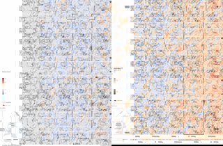
We used the Met Office Hadley Centre’s HADCRUT 4 dataset for the maps. It is ideal for this purpose as it offers a historic time series of land surface temperatures in a gridded format that can then be mapped.
Why did you choose to present the data in this way over other approaches?
This dataset has been mapped many ways before, but we wanted to take inspiration from Ed Hawkin’s climate stripes whilst maintaining the detail you get in maps. The ‘Peirce quincuncial’ map projection creates an earth that can be tessellated so it meant we could create map tiles we could piece together as a grid of stripes that show the general warming with the specific hotspots. You can read more about this here.
How else might this approach or data be used? How can the visualisation be taken a step further?
Once you have the framework there is nothing to stop other thematic datasets to be used as a way of charting change over time and fitting hundreds of tiny maps into a single graphic. The projection choice does have some drawbacks – it stretches some parts of the Earth’s surface a lot more than others – so these need to be set against the desire to create a single, impactful, image.
Try it yourself
To create this map you would need to re-project the HADCRUT data into the Peirce quincuncial and then tile it. This is something James achieved using the software package R. The final graphic you see here went through a number of iterations of design work in Adobe Illustrator and InDesign to create the finished product.
See more from Atlas of the Invisible, including a range of educational materials to accompany the book.
About the creator
James Cheshire is Professor in Geographic Information and Cartography (Department of Geography, UCL), Deputy Director of the ESRC Consumer Data Research Centre, and Director of the UCL Q-Step Centre.
His research focuses on the use of 'big' and open datasets for the study of social science. He has published in a range of journals on a variety of topics including the use of cycle hire schemes, the spatial analysis of surnames and new ways to visualise population data. James is the recipient of a number of major awards from the Royal Geographical Society (with IBG), The North American Cartographic Information Society, and the British Cartographic Society.
Aside from his academic outputs, he's the co-author of The Information Captial, Where the Animals Go and Atlas of the Invisible.
To find out more about James' work visit his website, or follow him on Twitter.
Oliver Uberti is a former senior design editor for National Geographic and the co-author of three critically-acclaimed books of maps and graphics: Atlas of the Invisible, Where the Animals Go and London: The Information Capital, each of which won the top British Cartographic Society Award for cartographic excellence.
You can find out more about Oliver's work on his website.