

Geovisualisation
Discover how geographers bring a unique perspective to presenting data in innovative and understandable ways.
Find a geovis
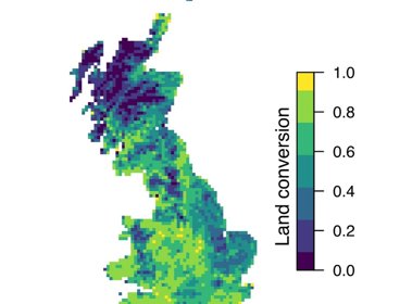
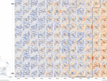
Mapping land-use change in Great Britain over the 20th century
Andy Suggitt and Alistair Auffret discuss how a chat over coffee led to them mapping and quantifying land use change in Great Britain from the 1930s to today.
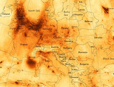
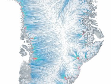
Air pollution in Europe
Discover how James Cheshire created this map displaying nitrogen dioxide levels across Europe.
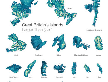
Great Britain's largest islands
Learn how Paul Naylor and his team at Ordnance Survey created this visualisation showcasing Britain’s largest islands.
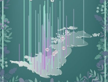
Britain's greenest city centres
We spoke to Dr Paul Brindley and Dr Jake Robinson about this visualistion showing Britain's greenest and least green city centres.
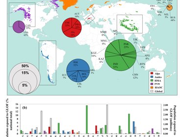
Mapping glacial lake outburst flood exposure
We spoke to Caroline Taylor, PhD researcher at Newcastle University, about this visualisation mapping exposure to glacial lake outburst floods.
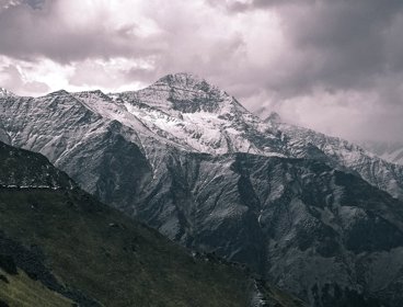
Visualising avalanches in the Himalayas
Geographers from the University of Aberdeen used earth observation data to understand avalanches in Chamoli district, Uttarakhand.
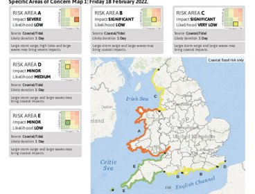
Flood Guidance Statement
Brian Vinall, Operations Manager at the Flood Forecasting Centre for the Environment Agency, worked with a team to develop the Flood Guidance Statement, which provides Category 1 and 2 responders with information to help them with emergency planning for flood events.
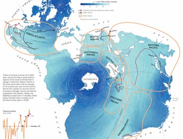
Atlas of the Invisible: one stormy sea
James Cheshire and Oliver Uberti created this visualisation showing a single ocean view of the world.
Atlas of the Invisible: ice flows
James Cheshire and Oliver Uberti created this geovisualisation showing the movement of ice on the Greenland ice cap.
Atlas of the Invisible: heat gradient
James Cheshire and Oliver Uberti created this visualisation showing the warming trend of the planet from the 1890s until 2020.
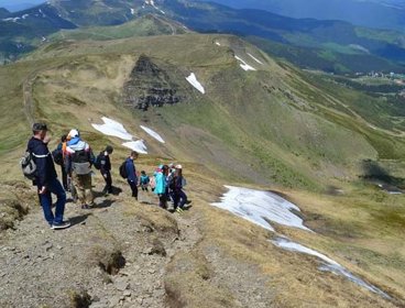
Virtual fieldtrips in Ukraine
We spoke to geography students in Ukraine about how they have been creating their own virtual fieldtrips due to the disruption to their studies.
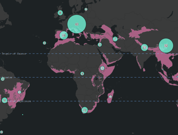
Mapping the extent of research into biodiversity hotspots
We spoke to Emma Underwood, PhD researcher at Kingston University London, about her visualisation on the extent of research into biodiversity hotspots.
Geography has never been more important in helping us to understand our rapidly changing world.
Geographers bring a critical perspective and approach to interpreting and presenting data. They help make new connections between different types of data by interweaving spatial methods with knowledge about our world, and finding innovative and understandable ways to present it.
In this series of images, we look at the power of maps and geographical data visualisations for telling stories about our world. We explore the ways in which connecting data on people, places and environments underpins good decision-making and improves communication and understanding. In the interviews with the creators that accompany each image, we showcase the skills, data, techniques and tools used to tell these stories, and the insight they can bring.
If you would like to suggest an image for the series, or would like to take part, get in touch at policy@rgs.org.