Paul Naylor, Cartographic Design Consultant at Ordnance Survey (OS), and the team at OS created a visualisation showcasing Britain’s largest islands.
Explainer
Here Paul discusses why they created the visualisation, the methods used and the impact it has had on social media.
What story does this visualisation tell?
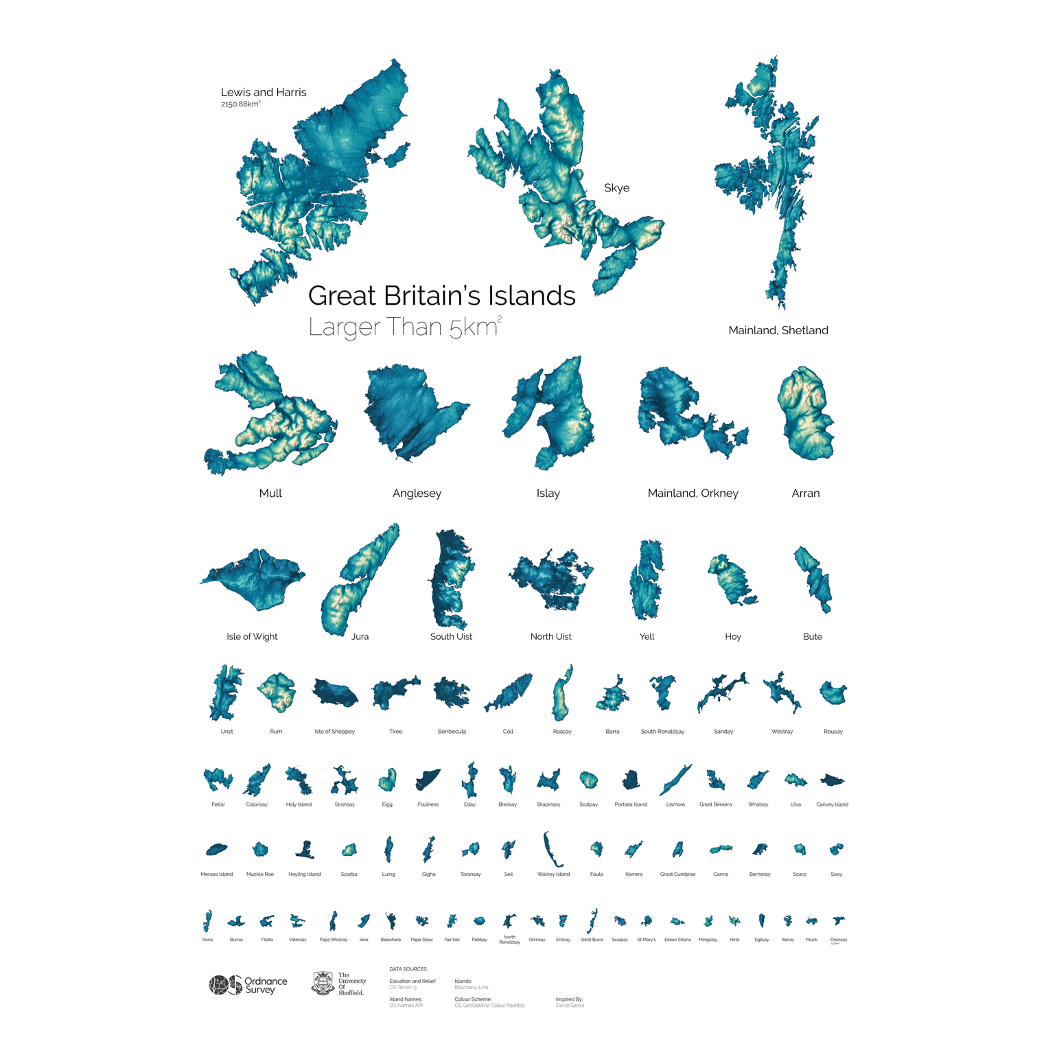
Great Britain is an island in its own right, but aside from the mainland, there are hundreds of islands around the British coast, many of which are uninhabited. Inspired by David Garcia’s data visualisation of the Philippines, we worked with Alasdair Rae at the University of Sheffield to explore Britain’s largest islands.
We found that there are 82 English, Scottish and Welsh islands larger than 5km². Scotland boasts the vast majority with 71, not surprising when you consider the Outer Hebrides, Shetland and Orkney and other beautiful islands off the coast. Wales had just two entries and England nine.
Why was it created?
It was created as a visual ‘art of the possible’ piece to show how OS data could be used to create rich, detailed terrain maps of some of Great Britain’s many islands. As an aside to this, a poster was created that was sold through the University of Sheffield’s online shop to help fund future field trips for students. It was pretty much intended for anyone, and in the end it became a really popular visual image on social media.
What data did you use to create it and why?
We used a range of OS data to analyse and present our final visualisation. OS has a range of rich and detailed geographic datasets which we were able to make use of and give us some amazing end visuals.
To work out those islands that were 5km² or more we used Boundary-Line (a product that maps every administrative boundary) to define the length of the coastline, which gave some interesting results. While Lewis and Harris topped the tables for being the largest island by area and boasted the longest coastline, not all islands had such a correlation. North Uist was the 12th largest island, but has the fifth longest coastline. Conversely, Arran was the eighth largest island but has the 18th longest coastline.
Adding in data from AddressBase, we compiled the number of residential addresses on each island and quickly realised that having the largest area does not equate to having the most addresses. Mull is the fourth largest island, but 18th when you look at addresses. Portsea Island tops the table for most residential addresses, but is 38th in the list of islands by area.
We used Terrain 5 (DTM of heighted points or contours at 5m intervals) to create our terrain or hillshade and the OS Names API (2.5m places in Great Britain) for the labels.
Why did you choose to present the data in this way over other approaches?
The visualisation was inspired by David Garcia’s data visualisation of the Philippines, so we wanted to replicate how he had represented his visualisation as closely as possible as this was created as a nod to his own excellent work.
How have people engaged with the visualisation – what has it enabled people to do?
It has become a really popular visual image that has inspired a lot of people across social media to try and visit every island. Hopefully some people have achieved some or all of this goal, but because of the current situation with regards to COVID-19 I’m hoping that it might provide people with something nice to look at whilst they are staying at home and keeping safe.
It also caused some discussion around what islands are part of Great Britain and what islands are not. There were a lot of questions asking where the Isle of Man was! Ordnance Survey are the national mapping agency of Great Britain and the Isle of Man is a self-governing British Crown Dependency.
How else might this approach or data be used?
Great Britain and the Philippine’s have been done, but there are certainly plenty more parts of the world that could be explored. Of course, you would have to consider other datasets to achieve similar results.
Try it yourself
Paul and the OS team used Boundary-Line to define the area and length of coastline for each island, and added in residential data from AddressBase.
To create the poster, they loaded the data into a PostGIS database, and analysed the data to calculate island area, coastline length and residential address counts. The hillshades were produced in Blender before they were imported into QGIS. From here, the team created hillshades using OS Terrain 5 and the colour schemes from the GeoDataViz Toolkit. Names were added using the OS Names API before each island was exported separately and then imported into Adobe Photoshop to produce the poster layout and apply the final touches.
About the creator
Paul Naylor is Cartographic Design Consultant at Ordnance Survey (OS), Great Britain’s national mapping agency. He is responsible for maintaining a high level of cartography across all OS products and services, designs the styles for new products and services, creates custom maps and marketing material, and blogs about all things map-related.
Paul is also a member of the British Cartographic Society and currently serves on their council.
You can follow Paul on Twitter at @cartocraftsman and find him on the OS blog.