How people experience the natural environment in England
Nathan Shaw, Senior Data Analyst at Natural England, created two visualisations to present a decade of data from the Monitor Engagement with the Natural Environment (MENE) survey. Here Nathan discusses why he created the visualisation, what it has enabled people to do and how this could approach could be taken further.
Explainer
What story does this visualisation tell?
The MENE survey has collected a decade’s worth of data on people’s engagement with the natural environment from 2009 to 2019. The survey focused on individual visits and wider visiting habits such as frequency, motivation and barriers, collecting data on outdoor recreation, pro-environmental behaviours and attitudes towards the natural environment. Each visualisation tells a different story from this dataset; from the fewer visits taken by low income, ethnic minority and old age groups to the overall outcome that spending time in nature is good for your wellbeing.
A story map presents a narrative of eight key points we learnt across the survey by harnessing maps, graphics and multimedia content.
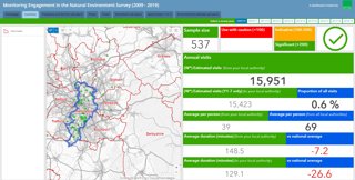
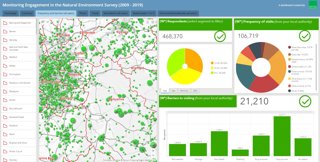
An interactive dashboard provides a localised summary of the raw data to provide a more bespoke story of visit trends within Upper Tier Local Authorities.
Why was it created?
The size and complexity of the dataset (multiple question frequencies, weights and geographical scales) has always been a barrier for our users, and we were aware that technical skills were required to get the most out of the data. Additionally, our users in academic institutions and public bodies just wanted figures / graphics to use for their own purposes and publications.
So we decided that through online visualisations we could do the processing work for our users and present them with tools that easily provide the figures they require.
We decided to create two visualisations to satisfy all our users, from researchers who are experts in their field to members of the public, and feel they complement each other well. The story map provides a broad overview of the survey with key take-home messages, and the dashboard provides a detailed method to explore the data and extract more bespoke and localised data trends.
Who was the intended audience?
The story map was developed as a visualisation that anyone, regardless of technical skill or prior knowledge of the survey, would enjoy reading and automatically understand what we learnt from the survey.
The dashboard was designed for Upper Tier Local Authorities to better understand visiting trends within their area, as well as any analysts looking to explore the data in more detail.
One unexpected use of the dashboard has been as a teaching aid in undergraduate and postgraduate degrees, for example at the University of Exeter.
What data did you use to create it and why?
We used the MENE data that we had collected over the past decade, which is approximately 500,000 records. The survey consisted of a variety of components with all data published as open data. The data, in a variety of formats, as well as related publications and ancillary datasets can be found on the MENE Access to Evidence page.
Why did you choose to present the data in this way over other approaches?
Alongside satisfying the needs of our users as mentioned above, we knew there would be several other benefits.
By using these tools, and developing the skills to build them, we can be reactive to current situations and provide visualisations of immediate benefit to our users and the research community. For example, we have rapidly created monthly indicators from the data to capture a unique view of visiting behaviour throughout the current pandemic and lockdown restrictions.
The development of these visualisations also increase the confidence people have in the project, and can be used to increase the reach and strength of the data through our own social media posts and publications as well as being picked up by external organisations.
How have people engaged with the visualisation – what has it enabled people to do?
Feedback has been really positive from our users and the visualisations have each been viewed by around 40,000 people. News agencies such as The Guardian, New York Times and the BBC have also run stories on data presented in the visualisations.
Additionally, there has been increased contact from a variety of organisations interested in getting the most out of MENE for their own projects; whether through the dashboard or other bespoke analysis.
How else might this approach or data be used? How can the visualisation be taken a step further?
The MENE data is open to anyone to use, analyse and develop it. We have just started a new survey called the People and Nature Survey which follows on from the MENE and for this we are looking at developing some more bespoke online tools using open source software such as R Shiny.
If you would like to know more about the People and Nature Survey and sign-up to the mailing list for the latest news, data and reports, then head to the User Hub.
Try it yourself
These visualisations were developed using ArcGIS Online, specifically the Operations Dashboard and StoryMap tools. Free trials are available for both of these tools. Online dashboards currently being developed for The People and Nature Survey are exploring the use of open source software.
About the creator
Nathan Shaw is a Senior Data Analyst at Natural England, who works on curating and analysing complex datasets as well as large-scale GIS projects in a variety of environmental applications.