
Andrea Ballatore, Lecturer in Social and Cultural Informatics at King’s College London, and Fiona Candlin, Director of the Mapping Museums research project, were interested in understanding the spatial unevenness of the cultural sector by studying the location of museums in relation to where people live across the UK.
What story does this visualisation tell, and why was it created?
The visualisations created show huge geographical inequalities in the sector, with some areas attracting a lot of museums and others very few. To do this we started by creating two figures. Figure 1 is a classic choropleth map showing the number of museums per 100,000 people, with a corresponding cartogram showing the local authority districts. The choropleth map (left) gives a recognisable geographical representation of the data which is easy for the reader to recognise. In comparison, the cartogram (right) shows administrative regions, which although loses the topographical accuracy, gives a better sense of the centres and peripheries of museum distribution.
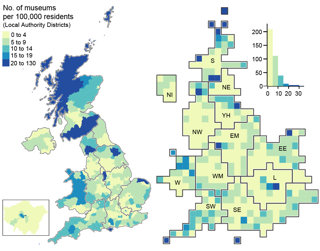
Figure 1: Choropleth map showing the number of museums per 100,000 people, with a corresponding cartogram showing local authority districts.
Figure 2 is a bivariate choropleth map, meaning it displays categories of values for two variables simultaneously. The underlying data are exactly the same as figure 1, but rather than looking at the number of museums per 100,000 people, it visualises the number of museums and number of people independently. This is a much more complicated visualisation to produce and interpret, however, if you compare it with the traditional choropleth, you get a much clearer picture of the emergence of museum hotspots and population distribution. When observing these maps, it is important to bear in mind that they do not differentiate between small and large museums but focus only on overall counts.
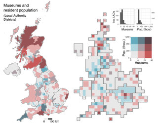
Figure 2: Bivariate choropleth map.
Who was the intended audience?
The project has engaged a wide range of audiences, including academics, particularly those researching museum studies and cultural policy, and professional audiences in the creative industries especially the national bodies with responsibility for museums (for example Arts Council England), and the general public who will have their own connections to and understanding of museums. Identifying the concentrations and absences can offer professionals and policymakers insights into the inequality of cultural provision. These visualisations are intended to open up questions about the unevenness of cultural provision in the UK and is intended to support future research into the museum industry across the UK.
What data did you use to create it and why?
We used two main data sources. The first was data on 3,200 museums across the UK collected from the Mapping Museums project. The second was ONS UK population data. The data included the location of the museums, although this is never entirely straightforward as some museums have multiple locations. Just as one example, the Tate has several branches including Tate Britain, Tate Modern, Tate St Ives, and Tate Liverpool. It was important for us to disaggregate such museums and to understand them as separate organisations that have a linked but also distinct history.
Why did you choose to present the data in this way over other approaches?
We considered other approaches to present this data. We started with non-geographical methods such as traditional bar charts, line charts and box plots, but in the end, we felt that choropleth maps and cartograms were the best approach to highlight centres and peripheries across the country. We included both choropleth maps and cartograms to highlight different aspects of the data and to encourage the reader to think about this space in different ways – not only the geographic space, but also administrative units. As we wanted to make the data accessible and legible to people that do not have a background or a training in data science, we used the administrative units familiar to people working in the arts.
What impact has the visualisation had in research policy or any other context?
Our work has impacted how the sector is understood. For example, both Arts Council England and the Welsh Government’s historic environment service have used the data to establish how many small unaccredited museums are open in the UK, thus gaining a more comprehensive understanding of the variety and extent of museums in their areas. The data was also used to support the Department of Digital Culture Media and Sport’s bid to Treasury for emergency funding during the COVID-19 pandemic. The data helped to give a very clear indication of the extent of the funding that was necessary.
If someone wanted to recreate a similar style of visualisation, how would they go about this?
We used open data source tools to create these visualisations, most of which were freely available online. We used R to format, process, and clean the data. The maps were then created without using traditional GIS, we used a range of packages including tmap and open resources from Ordnance Survey. Finally, we used Adobe Illustrator to pull the visualisations together and to give them a more visual coherence. An open-source alternative could be Inkscape.
How do you think the visualisation could be taken a step further?
This visualisation concerns the location of museums and residential population, but the visitor population is also important. Unfortunately, there is no consistent large-scale data about who visits which museums. It would be very interesting to understand the flows of people and how people travel to go to museums. Another aspect would be differentiating different types of museums to understand where large, medium and small museums tend to be located. It would also be interesting to map how museums relate to points of interest in their surroundings, for example abandoned mines and national parks as well as buildings such as libraries and archives. Developing a systematic mapping of the whole heritage sector would be highly beneficial for those working within it and for policymaking.
About the creators
, Professor of Museology in the School of Historical Studies Birkbeck, University of London, is the Director of the MMLab and Principal Investigator on Mapping Museums, Museums in the Pandemic, and Museum Closure.
, Lecturer in Social and Cultural Informatics at the Department of Digital Humanities, King’s College London, is Co-Investigator on the Museum Closure and Museums in the Pandemic projects, a contributor to the Mapping Museums research, and co-leads Museum Analytics.
To find out more have a look at the , which provides access to a searchable of over 4,000 museums, the , , and many other resources including at around 50 small museums.