Unlocking heat stored in Britain’s abandoned coal mines
Gareth Farr from The British Geological Survey, in collaboration with Charlotte Adams and Bohdan Iwanskyj from The Coal Authority, produced this visualisation revealing how Britain’s history as a coal-producing nation could offer innovative low-carbon heating and cooling, drawing upon the geothermal heat in legacy coal mines. Here they discuss why this visualisation was created, it’s impact and how you can create something similar.
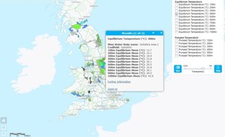
Coal Authority Viewer showing temperatures at 400m below the ground in British Coalfields.
Explainer
What story does this visualisation tell? Why was it created?
As the UK considers its transition to a net zero carbon economy, this visualisation shows where geothermal energy from abandoned coal mines could be used to heat homes and other buildings with minimal carbon emissions, reducing reliance upon electricity, natural gas and other fossil fuels for heating. Currently, heating in homes, businesses and industrial processes is responsible for a third of the UK’s greenhouse gas emissions.
As coal mines descend into the earth, the temperature increases at a constant rate due to the geothermal gradient created as heat radiates from the molten Earth’s core to the surface. As a result, water left to accumulate within mine networks has been heated by geological processes, providing a potential sustainable heat source across many parts of Britain. In many cases, heat may be harvested through pumping from existing shafts or from mine water treatment schemes, without the need to drill further into the former coal mines.
The interactive map shows where the mines are and the extent to which temperatures increase with depth.
The team linked together data collected when the mines were working and after they closed, to produce a single large-scale interactive map, enabling developers, planners and researchers to identify the areas with potential for further investigation as a sustainable mine energy heat source.
What data and technique/approach did you use to create it and why?
Mine temperatures were historically recorded because the UK government wanted to increase coal output, while taking into account evidence on safe working temperatures, ventilation, air quality and their impacts on mine workers.
These historic observations, taken in-situ within operational coal mines, were combined with more recent data obtained by The Coal Authority and British Geological Survey including: temperature profiles from boreholes and shafts that intercept flooded mines, and the BGS UK Geothermal Catalogue (UKGC), which contains borehole temperatures from across both mined and unmined areas of coalfields. In total, the data cover more than 170 years of temperature observations, and a range of methodologies needed to be standardised in order to combine them.
To compare in-situ coal strata temperatures, many measured over 100 years ago, to post closure flooded mine water temperatures we compared data for individual collieries across Britain. We found that broadly, when unaffected by localised pumping, they were comparable. This is an interesting finding as it suggests that the temperature of the mines should be stable over long periods of time.
Looking at the more recent data, most of which is water temperature in flooded mines, we manually checked each location to see if it was impacted by pumping. Pumping of water can create mixing in shafts and boreholes and thus bring warmer water closer to the surface. This can disturb the measured natural temperature gradient. Although warm water, close to the surface could be useful for mine energy schemes, it doesn’t reflect the equilibrium temperature gradients in the coalfields, so the data were separated creating an additional map of mine water temperatures under pumping scenarios.
The mine temperatures were then combined with other layers of data, to build the mapping tool. To visualise the mine temperature data in a spatial map format they were attributed to ‘Mine Water Blocks’ (MWBs). MWBs are delineated where hydrological and physical connections link or separate coalfields. They are used as a management tool by The Coal Authority when assessing the behaviour of mine water in different areas. To complement this the maximum and minimum depth of known working was calculated for each MWB, which allowed us to add a range of depth ‘slices’ with temperature data for each of them.
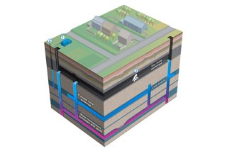
The types of data used to create the temperature maps courtesy of BGS, UKRI, 2021
What impact could the visualisation have in research, policy or other contexts?
The UK government has signalled its plan for a green industrial revolution, and a target to increase the number of homes on heat networks from 2% to 18% by 2050. Geothermal energy from mines, combined with heat pump technology, could provide a sustainable energy source that is both local and low cost.
With an estimated one-quarter of the UK’s population living above former coalfields, our analysis offers local authorities, planners and developers important information about local resources for heating homes and other spaces. Whilst not accessible to every region, many local authorities have mine energy potential on their patch and the interactive maps can be used to determine whether a potential scheme in an area of new development or redevelopment is worth looking at in greater detail.
The interactive maps also suggest the potential for former coalfield communities to undergo a significant socio-economic transition to a new renewable industry, creating employment and attracting investment in areas that were previously disadvantaged by mine closures.
Heat recovery and storage is still in the early stages of its development in the UK, and many challenges still need to be addressed, including ownership of the heat and the development of regulatory and licensing frameworks and costs. The interactive maps can help policy-makers to make these decisions.
Why did you choose to present the data in this way over other approaches?
Temperature maps are an easily understandable way to visualise data about geothermal potential for non-specialists.
We decided on a traditional 2D map format, over a complex 3D model for example, for various reasons. Firstly, many people can ‘read’ maps and presenting the temperature data in this format allowed us to engage with non-technical and technical audiences. Secondly the data, although the best available, were not detailed enough to create maps of a higher resolution. Finally, the maps can be easily integrated with many other maps (for example development areas) quickly and effectively.
We decided to present the maps in an open access viewer, with the data in an open access paper. This was core to the design and delivery of this project as it enables people to engage with the data at no cost.
How have people engaged with the visualisation – what has it enabled people to do?
The temperature maps received significant press coverage, with over 180 articles in local, national and global news outlets. The most immediate impact of this work is the ability to engage with the public and promote the concept of recovering heat from mines, which many people will not be familiar with. We also hope that it will be a vehicle for collaboration and investment, with research projects to address technical and scientific challenges of sustainable energy and feasibility studies and construction projects for new mine energy schemes. Publishing the maps has also generated lots of interest in the data, particularly amongst the academic community.
How else might this approach or data be used? How can the visualisation/data be taken a step further?
This approach to mapping subsurface temperatures can be easily scaled up to other subsurface settings around the world. All that is required are temperature data, measured or estimated geothermal gradients and a boundary which you will map to. The boundary could for instance be a certain geological formation or an area with similar hydrogeological properties (e.g. an aquifer unit). Once the data are checked the boundary files can be attributed with the data points, often this is done in a GIS program. If you are lucky and have lots of data points or a detailed understanding of your boundary conditions then more complex 3D visualisations and hydrogeological or heat flow models could be produced. This could allow different scenarios to be incorporated into the model, for example a proposed geo energy scheme, with its impacts assessed over a long period of time.
Try it yourself
If someone wanted to recreate a similar style of visualisation or analysis, how would they go about it?
You can find out more about the method the team used to create the temperature maps described above in this open access paper.
You can find out more about the team's work in the Geographical magazine article Heat from beneath: how the UK could heat homes from old coal mines.
About the creators
Gareth Farr is a Hydrogeologist at the Cardiff Urban Geo-Observatory looking at shallow geothermal heat recovery and storage in order to understand the way groundwater moves around in a complex geological environment changed by industrialisation and urban growth.
You can find out more about his work by following him on Twitter @GarethFarr1.
Charlotte Adams is Commercial Manager at The Coal Authority. A hydrogeologist by training and a former Assistant Professor at Durham University, she has an interest in water resource assessment and mine water treatment, with experience of working in the renewable energy sector.
You can find out more about her work on LinkedIn.
Bohdan Iwanskyj is Senior Project Manager at The Coal Authority and a Chartered Mining Engineer by training.
You can find out more about him on LinkedIn.