Dr Anshuman Bhardwaj and Dr Lydia Sam (both University of Aberdeen) created this visualisation of earth observation data to visualise and help understand avalanches in Chamoli district in the Indian Himalayas. We spoke to Dr Bhardwaj about the context of the geovisualisation, how and why they created it, and how you could create a similar visualisation.
Explainer
What story does this visualisation tell and why was it created?
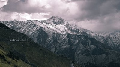
This animated geovisualisation tells the story of two massive avalanches in the Himalaya of Chamoli district in India. The avalanches occurred in the same valley, the first in September 2016 and the second in February 2021. Two massive but different avalanches from the same source and hitting the same valley within a period of five years is not very common.
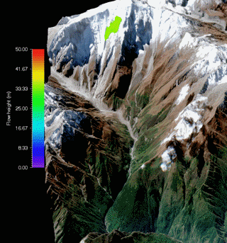
The Chamoli disaster site is a hotspot for avalanches. Scanning through satellite images from the last 20 years, we identified three major ice avalanches and several snow avalanches in the same valley. Ice avalanches in 2000 and 2016 filled ~3.5 km of the valley floor with debris that reached heights of up to 50m. The 2021 disaster was caused by an avalanche around 2.5 times more voluminous than the 2016 event, and was 80% rocks.
The 2016 avalanche occurred away from inhabited areas with no casualties, but the 2021 avalanche resulted in a debris flood that caused massive destruction of lives and infrastructure. It offered a natural testbed to understand how frequent avalanches can vary in impact. To make these events understandable, we created the geovisualisation.
Who was the intended audience?
The geovisualisation also supplements one of our recent research articles on the Chamoli avalanche event. Our aim was to provide a visual reference for how the two avalanches might have developed and to communicate that easily to both researchers and a wider audience.
What data did you use to create it and why? Why did you choose to present the data in this way over other approaches?
In our study, we were able to simulate and reconstruct the Chamoli disaster and a previous ice avalanche at the same site thanks to the archive of datasets from space agencies such as NASA and the European Space Agency. Earth observation (EO) data from satellites allows remote environments to be monitored quickly, safely and effectively. We used imagery from satellites such as Landsat and Sentinel-2, with resolution of spectral bands varying from 10 m/pixel (for Sentinel-2) to 30 m/pixel (for Landsat).
The United States Geological Survey (USGS) EarthExplorer data portal has a user-friendly interface and can be used to download these satellite imageries. It is preferable to look for images which have low seasonal snow cover and are cloud-free. In addition, high-resolution digital elevation models (DEMs) are also needed for modelling and for creating 3D visualisation. DEMs for various regions can also be downloaded from EarthExplorer portal.
What impact has the visualisation had in research, policy or other contexts?
The visualisation has raised community awareness and interest in mountain hazards. Since these are some novel findings on the nature and effects of frequent avalanche events, we see it as a small but important step towards developing hazard warning systems and relevant policy interventions.
The next step for us is to identify relevant agencies as collaborators and initiate a long-term research plan which culminates in studying more such events across the globe, so that we can suggest reasonable solutions to policy makers.
The visualisation has also attracted interest from news outlets (supported by our article in The Conversation) and the United Nations Office for Disaster Risk Reduction (UNDRR) has featured the visualisation on their Preventionweb platform.
Try it yourself
If someone wanted to recreate a similar style of visualisation, how would they go about it?
The main considerations for creating a similar visualisation are to think about what data are relevant and their availability at the right spatial scale. A similar visualisation of any avalanche event will require some knowledge of appropriate remote sensing datasets, data processing techniques, and modelling tools.
For our simulations, we used the Rapid Mass Movement Simulation (RAMMS) modelling tool, developed by the Swiss Federal Institute for Forest, Snow and Landscape Research. This tool offers a user-friendly interface to input all the needed data and generate an animated simulation at preferred tilt angle, resolution and with a meaningful background.
How else might this approach or data be used? How can the visualisation be taken a step further?
This approach can be used to differentiate various types of avalanches or mass movements such as ice avalanches, snow avalanches, debris flows and landslides. For our visualisation, we have used a satellite image as the background.
However, it can be replaced with high quality maps, drone images or digital elevation models. The visualisation can be significantly improved by using even higher resolution datasets, possibly acquired through unmanned aerial vehicles or drones.