Geovisualisation
Discover how geographers bring a unique perspective to presenting data in innovative and understandable ways.
Find a geovis
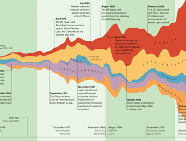
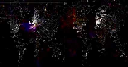
Weaponizing finance
Liam Keenan, Assistant Professor in Economic Geography at the University of Nottingham, discusses the creation of this stream graph, which illustrates the geographical distribution and evolution of financial sanctions since 1950.
Mapping of social sciences, humanities and arts (SHAPE) provision in UK higher education
Ruairí Cullen, Lynton Lees and Pablo Roblero from the SHAPE Observatory at the British Academy discuss their interactive tool which maps cold spots and changes in the provision of social sciences, humanities and arts (SHAPE) in the UK higher education sector over the last decade.
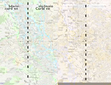
AI within a geospatial context
Steve Attewell has created an experimental map control system that uses hand gestures, voice recognition and artificial intelligence.
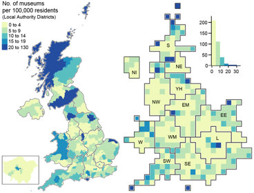
Mapping museums
Andrea Ballatore and Fiona Candlin used visualisations to better understand the spatial unevenness of the cultural sector across the UK.
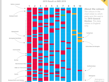
Voting patterns and deprivation in the UK
Learn how Alasdair Rae created this visualisation showing the link between voting patterns and levels of deprivation in the UK after the 2019 general election.
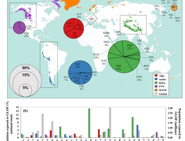
Mapping glacial lake outburst flood exposure
We spoke to Caroline Taylor, PhD researcher at Newcastle University, about this visualisation mapping exposure to glacial lake outburst floods.
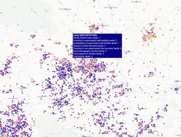
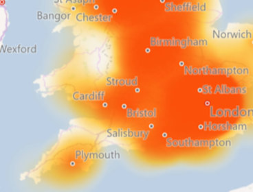
Priority places for food
We spoke to Peter Baudains about this visualisation displaying priority places for food.
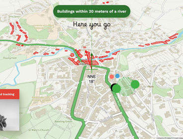
Mapping visual exposure and desirable passive surveillance
We spoke to Collins Terkpetey-Hushie about this visualisation assessing privacy, including why and how it was made.
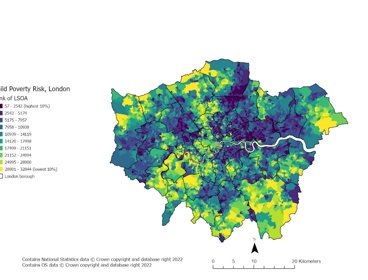
Child poverty in England
Dr Dianna Smith created a geovisualisation showing the risks of child poverty across England.
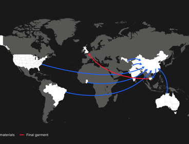
Disaster trade: garment production
Laurie Parsons discusses this visualisation showing the length and complexity of the supply chains that make the clothes that we use in the UK.
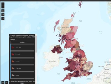
Local food insecurity in the UK
Dr Megan Blake, Dr Adam Whitworth and Dr Angelo Moretti created this visualisation, in collaboration with the Food Foundation, which illustrates UK-wide estimates of adult food insecurity at the local authority level.
Colour blind accessible mapping
Learn how Jessica Baker, Technical Relationship Consultant at Ordnance Survey, worked on a project offering colour blind accessible mapping as part of the OS Open Zoomstack product.
Geography has never been more important in helping us to understand our rapidly changing world.
Geographers bring a critical perspective and approach to interpreting and presenting data. They help make new connections between different types of data by interweaving spatial methods with knowledge about our world, and finding innovative and understandable ways to present it.
In this series of images, we look at the power of maps and geographical data visualisations for telling stories about our world. We explore the ways in which connecting data on people, places and environments underpins good decision-making and improves communication and understanding.
In the interviews with the creators that accompany each image, we showcase the skills, data, techniques and tools used to tell these stories, and the insight they can bring.
If you would like to suggest an image for the series, or would like to take part, get in touch at policy@rgs.org