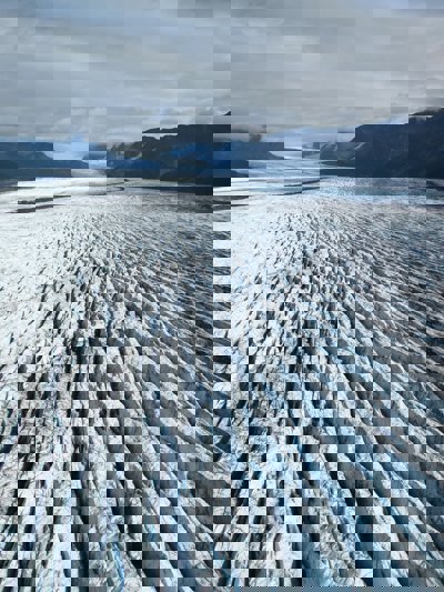
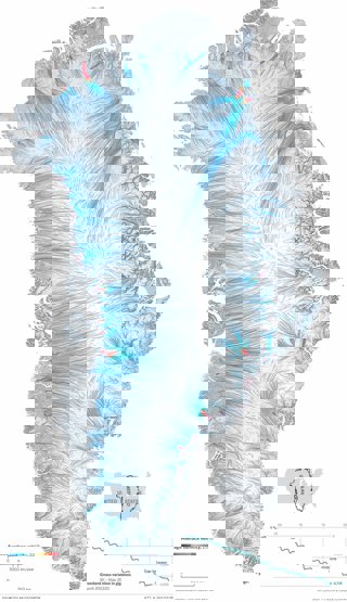
James Cheshire, Professor of Geographic Information and Cartography at University College London, and artist and designer Oliver Uberti, created this visualisation showing the movement of ice on the Greenland ice cap for their book Atlas of the Invisible. Here James explains why the visualisation was created, the data used and how you can create something similar.
What data did you use to create it and why?
We used data from NASA’s ‘ITS_LIVE’ project, which uses remotely sensed imagery to track the movements of ice over time. The brilliant thing about this project is that it enables researchers to have a single view of an entire ice sheet – be it as vast as Greenland or a smaller ice cap such as the Juneau Icefield – so that they can monitor its health. In this map we wanted to capture the dynamism of the ice by showing it as flow lines.
Why did you choose to present the data in this way over other approaches?
This approach offered a dynamic view in a single image.
How else might this approach or data be used? How can the visualisation be taken a step further?
This approach has been used in a number of ways to show the flows of ice and water. It’s also been really effective at wind and weather maps – one of the best examples is this by earth.nullschool.
Try it yourself
James highlights that there’s lots of hidden layers in the map – there is ice sheet height, snow cover, terrain and, of course, the ice flows themselves. It required using a combination of GIS software to gather the layers and then the software package R to generate the flows from the ITS_LIVE data. These layers were then combined in Adobe Photoshop, Illustrator and InDesign to create the finished map you see here.
See more from Atlas of the Invisible, including a range of educational materials to accompany the book.
About the creator
James Cheshire is Professor in Geographic Information and Cartography (Department of Geography, UCL), Deputy Director of the ESRC Consumer Data Research Centre, and Director of the UCL Q-Step Centre.
His research focuses on the use of 'big' and open datasets for the study of social science. He has published in a range of journals on a variety of topics including the use of cycle hire schemes, the spatial analysis of surnames and new ways to visualise population data. James is the recipient of a number of major awards from the Royal Geographical Society (with IBG), The North American Cartographic Information Society, and the British Cartographic Society.
Aside from his academic outputs, he's the co-author of The Information Captial, Where the Animals Go and Atlas of the Invisible.
To find out more about James' work visit his website, or follow him on Twitter.
Oliver Uberti is a former senior design editor for National Geographic and the co-author of three critically-acclaimed books of maps and graphics: Atlas of the Invisible, Where the Animals Go and London: The Information Capital, each of which won the top British Cartographic Society Award for cartographic excellence.
You can find out more about Oliver's work on his website.