
James Cheshire, Professor of Geographic Information and Cartography at University College London, and artist and designer Oliver Uberti, created this visualisation showing a single ocean view of the world for their book Atlas of the Invisible. Here James explains why the visualisation was created, the data used and how you can create something similar.
What data did you use to create it and why?
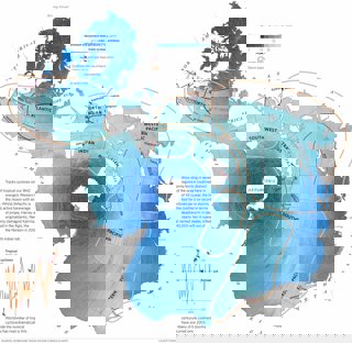
There are lots of data layers here – hurricane tracks, ocean currents, ocean temperature – that we have combined to a ‘single ocean view’ that was a map projection developed by Athelstan Spilhaus. We wanted to show the impacts of a warming ocean on the frequency and intensity of storms.
Why did you choose to present the data in this way over other approaches?
We thought this was a powerful way of showing the interconnectedness of the world’s oceans.
How else might this approach or data be used? How can the visualisation be taken a step further?
John Nelson of ESRI has some great examples of this how approach can be used on the ESRI Blog.
Try it yourself
For this map James used the Spilhaus projection available in ArcGIS. It was combined with layers generated in the software package R to show the ocean currents and temperature. The final design was undertaken in Adobe Photoshop, Illustrator and InDesign.
See more from Atlas of the Invisible, including a range of educational materials to accompany the book.
About the creator
James Cheshire is Professor in Geographic Information and Cartography (Department of Geography, UCL), Deputy Director of the ESRC Consumer Data Research Centre, and Director of the UCL Q-Step Centre.
His research focuses on the use of 'big' and open datasets for the study of social science. He has published in a range of journals on a variety of topics including the use of cycle hire schemes, the spatial analysis of surnames and new ways to visualise population data. James is the recipient of a number of major awards from the Royal Geographical Society (with IBG), The North American Cartographic Information Society, and the British Cartographic Society.
Aside from his academic outputs, he's the co-author of The Information Captial, Where the Animals Go and Atlas of the Invisible.
To find out more about James' work visit his website, or follow him on Twitter.
Oliver Uberti is a former senior design editor for National Geographic and the co-author of three critically-acclaimed books of maps and graphics: Atlas of the Invisible, Where the Animals Go and London: The Information Capital, each of which won the top British Cartographic Society Award for cartographic excellence.
You can find out more about Oliver's work on his website.