
Dr Mark Green, Senior Lecturer in Health Geography at the University of Liverpool, created this visualisation showing the accessibility of COVID-19 asymptomatic testing sites in Liverpool in November 2020. Here he explains the techniques he used to create it, why he presented it in this way and how this approach could be taken further in the future.
Accessibility of COVID-19 testing sites in Liverpool
Explainer
What story does this visualisation tell?
Facing the highest regional prevalence of COVID-19 in the UK, the UK Government piloted the first ever whole city provision of free and rapid SARS-CoV-2 lateral flow antigen testing for all residents in Liverpool without symptoms of COVID-19 between 6 November to 3 December 2020. While the aim of selecting the initial test sites was to ensure at least 75% of adults in Liverpool were within ‘walking distance’ of a test site, initial choices were also dependent on sites that the council could acquire.
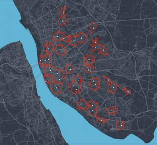
This visualisation explores the 15-minute walking accessibility (denoted by the red lines) around each test site (the white dots) in Liverpool as of 23 November 2020, demonstrating geographical inequalities in who can and cannot easily access asymptomatic testing. Although coverage is spread out across the city, there is a large gap in North Liverpool running from Everton to Walton; areas that are typically densely populated, deprived communities. Such communities have been hardest hit by the social, economic and health impacts of the pandemic, and the visualisation would suggest that the ‘mass testing’ pilot may further contribute to these inequalities.
This contrasted with more affluent parts of the city including the city centre, Aigburth and Childwall where access was generally good. COVID-19 is a disease that thrives on geography in how it spreads and the disproportionate communities it has affected. Mapping test site accessibility allows us to proactive reorganise and target low access areas to
Why was it created?
The large-scale asymptomatic community testing pilot was huge for Liverpool and the city was keen to make a success of it. However, few people had considered explicitly the role of geography in the design and impacts of ‘mass testing’. The aim of creating the visualisation was to support the delivery and targeting of testing, through exploring which communities had ‘accessible’ nearby test sites (defined here as a 15-minute walking distance). Understanding for whom testing was available and the impact this was having, was key to improving neighbourhood targeting of testing.
Who was the intended audience? What other audiences might be interested?
Primarily policy officials at Liverpool City Council, but also researchers involved in the design and evaluation of the ‘mass testing’ pilot. Hopefully the visualisation is of interest to anyone who wants to know more about the geographical inequalities evident in responding to COVID-19 or the key skills geographers have been contributing in helping respond to the pandemic.
What data and technique/approach did you use to create it and why?
Using the address of each test site, 15-minute walking distance was calculated via accessing the ‘HERE’ API (using R statistical software). Interactive maps were then created using the R package for ‘leaflet’ and disseminated in R notebooks for others to engage with maps directly (e.g., zooming into areas or overlaying additional data). The strength of the approach was to ensure an open source methodology that allowed others to replicate our work or deploy the same methods elsewhere.
Why did you choose to present the data in this way over other approaches?
Traditional visualisations are shared as static images. Through using a R notebook, we could share interactive plots where individuals could engage with maps such as zooming in or panning across Liverpool. These interactive elements of the outputs were well received among policy officials. Additional data (e.g. street networks, number of tests delivered, neighbourhood deprivation) could then be overlaid with the data to explore geographical inequalities.
What impact has the visualisation had in research, policy or other contexts?
Sharing the visualisation has been positive. The plots were shared widely both within Liverpool City Council, among the evaluation team at University of Liverpool, and to external stakeholders including Department of Health and Social Care, and SAGE (Scientific Advisory Group for Emergencies). Liverpool City Council invited me to produce additional accessibility maps including identifying the best sites (via Location Allocation techniques) for locating new ‘pop-up’ testing sites for the final ‘Super Weekend’ push at the end of the pilot. Subsequentially, I was made part of the evaluation team leading on understanding the social and spatial inequalities in uptake, including whether accessibility was important for explaining patterns in uptake (spoiler: it was).
How have people engaged with the visualisation – what has it enabled people to do?
Positively! Mapping can be powerful - a message conveys a thousand words and this was a helpful tool for demonstrating the extent of geographical inequalities. Having an interactive tool, via R Notebooks, certainly helped more here as it allows people to engage more with the visuals.
How else might this approach or data be used? How can the visualisation be taken a step further?
I am sure the visualisation can be made to look more visually impressive, however, the underlying techniques can be applied to a range of topics and issues. We have been looking at how access to a variety of neighbourhood and environment features shape our health (see an example here). Such data can be compared to external data (e.g. testing uptake or neighbourhood demographics) to examine the outcomes associated with testing or the types of populations who can access testing. These techniques are going to become important in identifying suitable vaccination sites as we begin to scale up vaccinating our communities equitably.
Try it yourself
If someone wanted to recreate a similar style of visualisation or analysis, how would they go about it?
The map was created using R statistical software and was remarkably simple to code up. Sample code is shared on Github. Although R can sometimes not be user friendly, Mark found it easier for mapping accessibility than traditional GIS software, with additional benefits to allow replicable code. To calculate accessibility around specific locations (i.e., test sites), he used the ‘isoline’ command within the ‘hereR’ R package (defining mode as pedestrian and range as 15 minutes). The ‘HERE’ API is free to access (albeit with a rate limit). You can also create accessibility between two sets of points, for example the distance of each address to its nearest test site
To map accessibility, Mark used the ‘leaflet’ package which produces interactive maps in a few lines of code. Such maps can be embedded within html files, allowing them to be shared to others who can then interact with maps. He used R notebooks here, since they contain both code and outputs together. To create the specific visualisation for the blog, Mark used ‘ggplot2’ and ‘sf’ to create a static map with data from OpenStreetMap for the backgrounds. Colours were selected to be visually striking, although he notes such an approach isn’t necessarily best practice for sharing with policy makers where simplicity is preferred.
About the creator
Dr Mark Green is Senior Lecturer in Health Geography at the University of Liverpool. His research spans understanding the ways in which the features of where we live and interact with daily imprint on our health; and combining understanding health behaviours with maturing data mining approaches.
You can find out more about Mark and his research on his work profile.