Dr Kingsley Purdam, Lecturer at the University of Manchester, created this visualisation linking life expectancy estimates with some of the most famous places and landmarks in the UK.
Visit Britain: Differences in life expectancy by famous places and landmarks (https://journals.sagepub.com/doi/full/10.1177/0308518X19860543)
Explainer
What story does this visualisation tell? Why was it created?
Life expectancy in the UK is lower than many other countries with similar levels of economic development – for example, in Japan, men live on average two years longer, and women four years longer than in the UK. Differences in life expectancy are also evident within the UK, between different regions, cities and even between individual neighbourhoods. Moreover, in some areas of the country – including Devon, Hartlepool and Derbyshire - life expectancy is now declining. There are also age-related disparities, for example in Northern Ireland, life expectancy has declined for men over 65, and across the UK life expectancy is no longer increasing for older people.
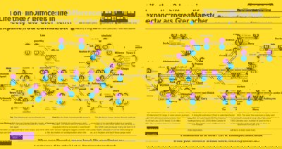
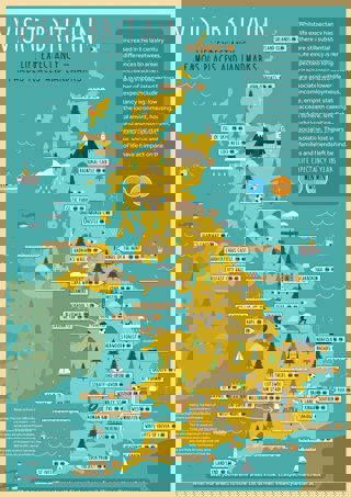
I created this map, with input from my colleague Harry Taylor at the University of Manchester, to help raise public and policy-maker awareness of the stark inequalities in life expectancies across the UK. The map displays data on life expectancy estimates with some of the most famous places and landmarks in the UK, drawing attention to the geography and reality of this national problem. As one example, life expectancy in the Blackpool Tower area is 70 years for men and 79 for women, whereas in London’s Knightsbridge neighbourhood it is 89 years for men and 92 years for women. These differences in life expectancy between places reflects the inequalities in the lives of the people who live there.
Who was the intended audience?
We intended the map to raise awareness among the public and policy-makers of the inequalities in life expectancy. We wanted the map to have a clear style that was identifiably that of a tourist information map to resonate with those audiences and provide the data in a uniquely accessible format. The cartoon style was a key design consideration. We had to compromise on including a wider spectrum of relevant information (such as socio-economic data or area boundaries) to ensure the overall message was clear.
We titled the visualisation ‘Visit Britain’ to echo the ways the UK is promoted as a tourist destination – in fact, VisitBritain as one word is a name used by the British Tourist Authority!
What data did you use to create it and why?
We used the postcodes of landmarks to match them to local area or ward data on life expectancy. Data on life expectancy was obtained from the ONS, National Records of Scotland and Northern Ireland Department of Health. The data varied slightly between agencies in that life expectancies from England, Wales and Scotland used five years of mortality data for local government district areas, while Northern Ireland used three years. We chose the landmarks from tourist information guides.
What impact has the visualisation had in research, policy or other contexts?
The visualisation is an entry point and stimulus for public awareness and policy discussions around life expectancy and inequalities, and the geographies thereof.
These differences in life expectancy can be traced to a host of interrelated factors.
Health problems are an important factor – dementia, Alzheimer’s, heart disease, strokes and lung cancer are among the most common causes of death in the UK. These are linked to and driven by deprivation, including factors such as poverty, social status, diet, smoking and alcohol consumption, and access to health care. As we noted in our paper, deprivation and premature mortality are linked, and disparities between areas are growing.
The visualisation helped raise awareness of the disparities in life expectancy, in particular being used in the media as an accessible illustration of the issue. We wanted the visualisation to be instantly recognisable as a tourist-information-style map, and provide a visual reference to engage with rather than just tables of data.
The accessibility and focus on public communication was realised when the graphic was reproduced by The Scottish Sun newspaper, focusing on disparities in Glasgow, where we were also able to comment on the research findings.
How have people engaged with the visualisation – what has it enabled people to do or encouraged them to think about differently?
In addition to The Scottish Sun, I was also able to communicate these findings to the public via articles in the Big Issue North and comment on the BBC website and Daily Mirror. The accessible format and focus on points of interest enabled media outlets to highlight the geographies and landmarks to communicate the issue in a context relevant to their readers – demonstrating the utility of geovisualisation in communicating and contextualising complex issues and information. Raising awareness of these issues should enable more public awareness and discussion about the policy determinants of deprivation. For example, austerity and cuts to the NHS, including to the National Health Service, have been identified as having an impact on health outcomes.
How else might this approach or data be used?
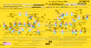
I took a similar approach to visualising life expectancy variation at a smaller scale, within Greater Manchester. Rather than a tourist-style map, I reworked the map of Greater Manchester’s Metrolink tram system to show life expectancy estimates at different stops.
From http://blog.policy.manchester.ac.uk/
This map illustrates, for example, that over a 30 minute journey, life expectancy can decline by 10 years. This presentation of data can underpin discussion about the causes of inequalities, such as cuts to services for older people, and the human rights implications this has. Again, the visualisation was widely reported in the media.
I was later able to adapt this visualisation to show voter turnout in local elections.
Part of the strength of this approach was that it uses a design vernacular that readers, especially residents of Greater Manchester, can easily recognise, meaning they already understand the geography and the format of the data.
Try it yourself
Kingsley suggests trying to find ways to present data that link to people’s lives alongside the standard tables and charts. A brightly coloured chart with lots of lines does not necessarily make something understandable or memorable. Draw on other disciplines for creative inspiration including art, theatre and film, and look outside your data to help tell the story of the data. He also found that working with a graphic designer also proved invaluable in terms of sharing ideas. Finally, he suggests asking colleagues and friends (outside the research area) about how understandable the information is can be very useful in revising and finalising the visualisation.
About the creator
Dr Kingsley Purdam is a Lecturer in Social Research and Statistics at the University of Manchester. He is an expert in research methods and in public consultation with a specific focus on civic society, citizen involvement and policy making. He has worked on a range of national research projects across challenging social policy areas working both in the public and private sector, with his research being featured on the BBC and ITV News and in the national and local press.
You can find out more about his work on his University of Manchester profile.