Mapping glacial lake outburst flood exposure
We spoke to Caroline Taylor, PhD researcher at Newcastle University, about this visualisation mapping global exposure to glacial lake outburst floods and how the visualisation was created.
Explainer
What story does this visualisation tell?
As glaciers retreat, meltwater can accumulate and be trapped by natural dams of rock and ice to form glacial lakes. Increases in meltwater, or falling rock and ice, can cause natural dams to fail and large volumes of glacial meltwater to burst from reservoirs, known as Glacial Lake Outburst Floods (GLOF). These high magnitude floods often arrive with little warning and can cause significant damage to infrastructure and land, and result in loss of life. Climate change is predicted to increase the formation of glacial lakes and as a result GLOF could pose an increasing threat to people and communities living in close proximity to glacial lakes.
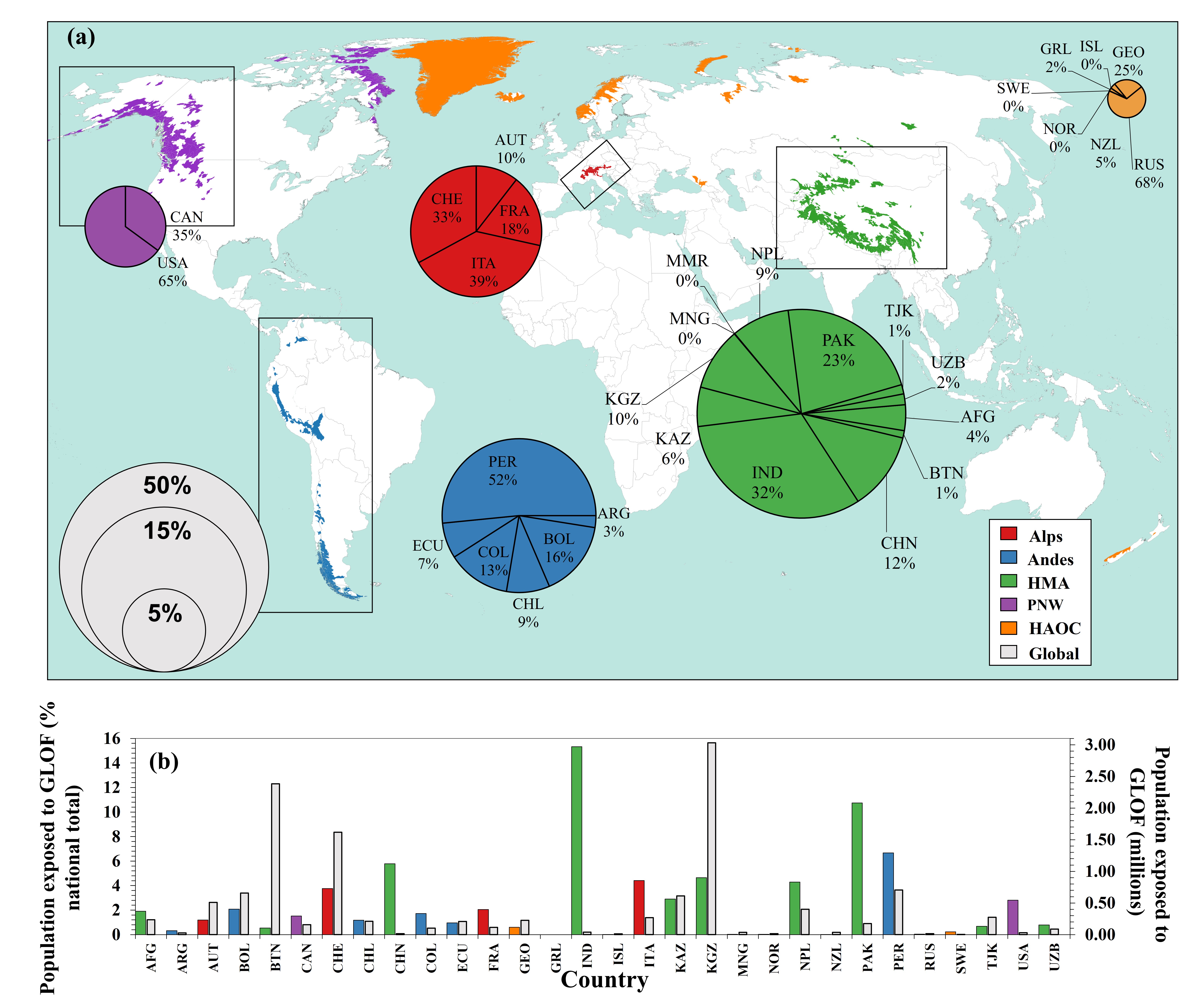
Our visualisation shows how Glacial Lake Outburst Flood exposure is distributed across 1,089 glacial basins globally, as of 2020. Regions are colour coded according to mountain range and the pie charts show proportions of exposed population by country within each region. The size of the pie chart corresponds to the percentage contribution to the 2020 global total of people exposed to GLOFs.
Why was it created?
Whilst many studies focus on the lakes themselves, it is also important to map what exists downstream of the lakes to identify the areas where GLOFs have the potential to cause the most damage.
Prior to our research, it was unclear how many people globally lived in close proximity to glacial lakes and therefore where people and communities are most at risk from GLOF hazard. We created this map and graph visualisation to highlight population exposure at the global, mountain range, national, and basin scale, and to aid future research and mitigation efforts.
Who was the intended audience?
We wanted to create a visualisation that could be used to support more targeted studies as well as guide mitigation and reduction strategies aimed at GLOFs. We hope to reach researchers as well as local and national governments through the visualisation.
What data did you use to create it and why?
To measure exposure we combined satellite-derived data on the location and size of glacial lakes with an existing global population model and a series of population metrics. The glacial lake shapefiles spanning 1990-2018 were derived from optical imagery from Landsat missions 4, 5, 7, and 8, with a Normalised Difference Water Index-based model implemented in Google Earth Engine to identify glacial lakes. The shapefiles are available here.
We made an estimate that anyone living within 50km of a glacial lake and 1km of a river that originates from a glacial lake could be directly or indirectly impacted if one or more of the lakes upstream failed. We then used the population model to count how many people live in this area, allowing us to estimate the number of people threatened in each catchment, country and mountain range. All the data used to create the visualisation is open access and updated frequently, allowing for continued monitoring of GLOF exposure over time.
Why did you choose to present the data in this way?
This is the first time we have been able to globally estimate the number of people exposed to GLOFs and identify areas right down to the basin scale that should be considered the highest priority for further analysis and potential intervention for risk reduction.
Whilst interest and coverage of GLOFs as a natural hazard has increased in recent years, it is often the same locations that are studied or that receive media interest. With our visualisation, we hope to direct future work by highlighting locations that should be targeted for research. For example, the majority of research conducted across High Mountain Asia is located in the east (Bhutan, Nepal etc.), however our visualisation shows exposure is higher in the west (e.g. Pakistan).
How have people engaged with the visualisation and what impact has the visualisation had in research, policy or other contexts?
The visualisation has raised community awareness and interest in GLOF hazards. We have had correspondence with scientists seeking to conduct local-scale studies in their local communities based on the results of this study. Since these are some novel findings on global GLOF exposure we see it as a small but important step towards improving understanding of drivers of GLOF danger that could aid policy interventions and ultimately reduce GLOF danger and prevent disaster.
The visualisation has also attracted substantial interest from news outlets (supported by our article in Nature Communications).
Travelling further
If someone wanted to recreate a similar style of visualisation, how would they go about it?
The main consideration for creating a similar style of visualisation is to think about what data is relevant and their availability at the right spatial scale. All the data used to produce our visualisation are open access, thus others could easily collate suitable data. We used QGIS to produce the final visualisation. This software is free and offers a user-friendly interface to input all the needed data.
How else might this approach or data be used? how can the visualisation be taken further?
Our visualisation was produced to demonstrate GLOF exposure, using a cut off distance of 50km from a glacial lake and 1km from a glacial-fed river as our exposure buffer. However, our methods could easily be adapted for other natural hazards (e.g. earthquakes, river floods, avalanche) by redefining the ‘exposure buffer’ appropriately to reflect the natural hazard in question.
We are keen to continue to develop our exposure index and the associated visualisation. We plan to monitor GLOF exposure annually and incorporate up-to-date data as it becomes available. Adding more granularity to the exposure metric would be beneficial, thus obtaining basin-level data will be a consideration for the future.
About the creators
This research was conducted by Caroline Taylor, a PhD researcher at Newcastle University. You can find out more about Caroline on Twitter. The work was supervised by four others:
Dr Stuart Dunning. Reader in Physical Geography at newcastle University. Research interests in landslides, geomorphology, hazard, and risk (@Rock_Avalanches)
Dr Rachel Carr. Senior lecturer at Newcastle University. Research interests in climate change and the cryosphere.
Dr Thomas Robinson. Senior lecturer at University of Canterbury. Research interests in earthquake hazards and disaster risk (@Dr_TRob)
Dr Matt Westoby. Associate Professor at Northumbria University. Research interests in glacial geomorphology, reconstruction, modelling (@MattWestoby)