Dr Faith Taylor, and a team at King’s College London, created this visualisation showcasing the less tangible aspects of flood resilience, such as social connections and a sense of place, in low-income communities. Here she discusses why she created this map, the techniques she used and how you can create something similar.
Explainer
What story does this visualisation tell?
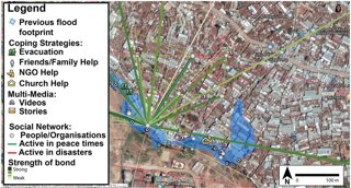
Many of the ways people cope with floods are through their social connections, past experience and sense of place – things that are tricky to show in a GIS map. These messy maps aim to show these less tangible aspects of flood resilience in the low-income settlement of Kibera in Nairobi, Kenya. We focus on two main layers: spatial social network maps that show the range of formal and informal actors involved in flood response, and ‘Storyspheres’ which are immersive, 360-degree photos combined with directional audio representing the voices of local people.
Why was it created?
GIS dashboards are great to help us visualise spatial data and make decisions. However, in the past, GIS has more typically been used to show quantitative information about physical objects that are fixed in space (e.g., roads, pipelines). This has left little space for more qualitative, contextual information to be included in decision making. We wanted to demonstrate how standard GIS tools could be used more qualitatively to better communicate the contextual details of a place, and thus make more sensitive decisions about flood resilience.
Who was the intended audience? What other audiences might be interested?
Maps are normally used as a piece of evidence to convey one perspective and make a decision. In the messy maps we have created, you can’t just glance at these and decide on one outcome. The maps take time to explore and digest, and tell complex, sometimes even conflicting, stories about how people cope with floods. We call these maps ‘conversation openers’ – tools to communicate the rich contextual detail of a place and open up a discussion with the community about the many possible ways forward for resilience planning.
The messy maps are targeted at the range of decision makers involved in flood resilience planning in Nairobi. This includes local government, but also the private sector and NGOs. The messy map layers can be overlaid with more typical GIS layers used for urban planning and resilience to help better communicate the context in which planners are working, rather than simply focusing on quantitative data about objects that are fixed in space. This can help reveal complex spatial and temporal patterns (e.g., the social networks people rely on to cope with floods evolve over time and often span great, sometimes international distances), and consider how more sensitive planning strategies could be developed.
What data and technique/approach did you use to create it and why?
In collaboration with social scientists, local NGOs and artists, we ran arts-based workshops in Nairobi and Cape Town (think singing, drawing and dancing rather than dry surveys or interviews – very different to my usual work!). From the workshops we generated information about social networks (who helps during a flood and where are they located) and stories (what has happened in the past and why). We also used low-cost smartphones to collect Storyspheres and created an open, online map that contained multi-media pop-ups (e.g., videos and text narratives), spatial social networks, and Storyspheres.
Why did you choose to present the data in this way over other approaches?
We hope that by using the technical tools of urban planners (GIS), they feel more comfortable in exploring the qualitative data we have collected and visualised, as opposed to receiving this in other qualitative formats (e.g. reports). The idea for the Storyspheres came from conversations with our local partners who said that some sites in Kibera are difficult to access, and thus would rarely be visited by urban planners. So, rather than seeing Kibera in a top-down 2D map, could we bring Kibera to them, in an immersive, 3D ground level view, coupled with voices of local people.
What impact has the visualisation had in research, policy or other contexts?
Our methods are starting to be taken up in other projects, both locally in Nairobi and further afield – watch this space for Storyspheres appearing in other projects. In the long run, I would love for some of the simple, qualitative GIS techniques we have developed to be adopted as standard practice in mapping. We are currently working on developing training resources and working with stakeholders to make sure this happens.
How have people engaged with the visualisation – what has it enabled people to do?
From speaking with urban planners, they have commented that by hearing and seeing the human stories about a place, it helped them remember more about the location than standard GIS layers alone. The Storyspheres are particularly useful as a ‘virtual fieldtrip’ for planners to see and hear about places that are difficult to access, particularly during COVID-19.
We are currently working on developing training materials so that others can experiment with creating messy maps as conversation openers for a range of urban issues.
How else might this approach or data be used? How can the visualisation be taken a step further?
The Storyspheres are a really useful teaching resource – it would not be possible to show students some of the parts of Kibera that are visible in the Storyspheres and hear the voices of local people otherwise.
From a physical geography perspective, I have been collecting a few Storyspheres in dynamic locations such as river channels, with the idea that students could use these to visualise landscape change over time. For example, showing students historical Storyspheres and comparing this to field observations.
Try it yourself
If someone wanted to recreate a similar style of visualisation or analysis, how would they go about it?
Faith encourages others to incorporate small amounts of qualitative GIS into their own work (e.g., embedding photo-pop ups, including videos, or weaving standard maps together with a narrative in an ESRI or Knightlabs Storymap.)
The Storyspheres are a great, simple addition to a map, to add context and represent differing opinions about one space. All you need is a smartphone and access to the Storymaps website.
Keep an eye out on www.emorfmaps.wordpress.com for training resources on how to create Storyspheres and social network maps.
About the creator
Dr Faith Taylor is Lecturer in Physical Geography Education at King’s College London. Her research looks at the development and use of spatial and statistical models for natural hazards, particularly in the urban Global South.
You can find out more about Faith’s research on her KCL page, which includes a short video of Faith talking about this project.