
Dr Robin Lovelace, Associate Professor of Transport Data Science at the University of Leeds, and colleagues have created an interactive map-based web tool to help identify promising locations for new cycleways in England. The Rapid Cycleway Prioritisation Tool is a free and open tool funded by Sustrans and the Department for Transport which helps to ensure that the government’s £250m Emergency Active Travel Fund is spent where it is most needed, for maximum long term benefit (Lovelace et al, 2020).
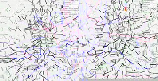
The map output of the Rapid Cycleway Prioritisation Tool for London
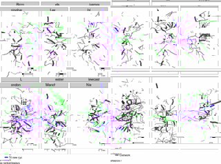
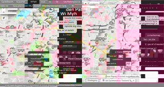
Comparing the map outputs for Birmingham, Leeds, Liverpool, London, Manchester and Newcastle.
Explainer
What story does this visualisation tell?
Cities worldwide are preparing for the long transition out of lockdown. Physical distancing measures will be in place for many months, impacting all walks of life, including transport, and with public transport options running at low capacity, solutions are needed now more than ever.
New cycleways are being introduced in many cities, allowing healthy habits started during the lockdown to continue. Transport authorities must act fast, however, to take advantage of the current cycling boom while traffic levels are still below normal, and to avoid gridlock.
The Rapid Cycleway Prioritisation Tool provides an interactive map for every transport authority in England. The main result is a list of road sections that have both high demand and sufficient space for cycling.
These are represented as blue lines in the maps hosted on the Rapid Cycle Prioritisation Tool website (click on the map to see results for your area) with additional layers including existing off-road cycleways (shown in green), which in many cities are disjointed or of variable quality, and, in purple, a vision of what a joined-up cycle network could look like.
This new tool builds on our previous work, carried out with other universities, to help authorities identify and develop strategic cycle networks. We created a national dataset of roads, including estimates of the number of lanes in either direction and road width, to help identify where roads have space that could be reallocated to widen pavements or to rapidly introduce new cycleways.
Who was the intended audience?
The main purpose of this project was to inform bids for Tranche two of the Emergency Active Travel Fund, particularly for authorities which have not yet developed Local Cycling and Walking Investment Plans (LCWIP). Tranche two will fund permanent infrastructure schemes aimed at increasing active travel and helping to shift people away from public transport given capacity constraints imposed by social distancing.
For each combined and local authority, the tool identifies existing cycleways, promising locations for new cycleways on roads with spare space and what a cohesive cycling network might look like in the longer-term. Local authority transport planners in highways, walking and cycling teams in transport authorities across England are the main target audience, however, engagement with multiple stakeholders and the wider public is a vital part of the transport planning process. Therefore, we encouraged citizen engagement, resulting in over 100 mentions on the tool on social media and countless interactions via the WidenMyPath project that has incorporated the results. If you want to find out more about citizen engagement take a look at the 'Get involved' section towards the bottom of the page.
What data did you use to create it and why?
The main two data sources used in the tool were road network data from OpenStreetMap (OSM) and estimates of cycling potential under the Government Target scenario, down to the road segment level, from the Propensity to Cycle Tool (PCT), a strategic planning support system hosted at www.pct.bike. We used OSM data because it contains information on the number of lanes on each road worldwide, a great example of the power of volunteered geographic information. Road width estimates were taken from a previous project (see cyipt.bike for details).
The PCT contains estimates of where cycling has the most potential to grow. By combining these two datasets we could identify and rank (in terms of cycling potential) roads with both space available for walking and cycling without changing the navigable network, and likely levels of use if well-designed interventions are implemented.
We used R, a free and open source statistical programming language with powerful geographic capabilities, to process the data. See the free and open online book Geocomputation with R, for more on the technology used to create the rapid tool, and to give it a try for yourself.
What impact has the visualisation had in research, policy or other contexts?
An important finding is that many cities have wide roads with spare space, as shown in the maps of six major cities above. Notably, none of these cities yet have a joined-up cycle network. An example of the type of road highlighted by our tool is Kirkstall Road in Leeds, which has high cycling potential and sufficient width for new cycleways. Kirkstall road is already part of plans by Leeds City Council to become a trial cycleway. The results for Leeds are shown below, showing the three main layers in the tool: existing cycleways, top ranked roads with spare space, and an approximation of what a cohesive, joined-up network could look like.
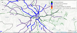
The map output of the Rapid Cycleway Prioritisation Tool for West Yorkshire, zoomed in on Leeds.
New cycling infrastructure is more likely to be effective when it is developed based on analysis of the best available data, in combination with vital local knowledge. City planners, politicians and citizens need to act to ensure that transport interventions made during the crisis are of maximum benefit now and in the post-pandemic world.
The tool is already being used by multiple local authorities to support the business case for road space reallocation schemes, including in Greater Manchester, West Yorkshire and Nottinghamshire. It is informing countless conversations and ‘nudges’ encouraging decision-makers to develop bold plans that “meaningfully alter the status quo” of road networks, as Rupert Furness, Head of the Active and Accessible Travel team in the UK Department for Transport, put in a letter to all transport authorities earlier this year (source: Forbes.com).
The fact that the data can be downloaded as open data mean that local authorities, researchers and others can further build on the results. City authorities across the world are designing a future that can emerge from the disruption of the COVID-19 pandemic, and tools with interactive geographic visualisations can support strong, evidence-based and cost-effective plans such as those shown in the figure below from Leeds City Council.
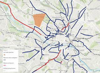
New cycleways and walkway improvements planned or under investigation in Leeds.
How have people engaged with the visualisation?
I have been amazed by how many people have engaged with the tool. People from across the country, including Birmingham, Bristol, Leicester, Nottingham, London, Manchester, Newcastle, Norwich, Southampton and Worcester have been in touch. For an insight into the amazing levels of engagement and feedback that has been generated, I recommend checking out Twitter messages mentioning the tool, tweets mentioning WidenMyPath and our GitHub ‘issue tracker’ where we have benefited from community feedback in the open source code repository we created to ensure reproducibility.
If you are interested in software development, and R programming in particular, please do get in touch if you’d like to support the development of future free and open tools for sustainable transport planning.
How else might this approach or data be used?
Our methods, based on open data and code, could be used in cities worldwide. Given the global nature of the challenges we face, open and collaborative research is vital. The potential for international application can be seen in research we carried out for the World Health Organisation on possible cycling uptake in cities in low income countries.
Try it yourself
Data about the tools informing the model can be found here:
For expert users, the code underlying the project can be accessed here. If you would like to support the project with technical input, please provide feedback via the GitHub 'issue tracker'. Data generated by the project can be downloaded from GitHub (e.g. see GeoJSON files for London here).
Get involved
For an introduction to the tool from the Department for Transport, with a live demo by Robin and explanation of how to use it to support infrastructure design from engineer Brian Deegan, see The Rapid Cycleway Prioritisation Tool video on YouTube.
To support evidence-based, democratic and participatory transport interventions, check out the results for all cities in England on the Rapid Cycleway Prioritisation Tool website. To comment on roads in your area and upvote where extra space is most needed for walking and cycling, you can also see the results on the WidenMyPath website (see below).
The data in action: results of the Rapid Cycleway Prioritisation Tool (dark red lines) in the WidenMyPath web application.
About the creator
Dr Robin Lovelace is Associate Professor of Transport Data Science at the University of Leeds. His research focuses on the energy impacts of transport systems, modelling the uptake of sustainable transport uptake, new methods on transport geography and visualising transport futures at a local level.
You can find out more about Robin on his website and follow him on Twitter @robinlovelace.
References
Lovelace, R., Talbot, J., Morgan M. and Lucas-Smith, M. (2020). Methods to Prioritise Pop-up Active Transport Infrastructure, Transport Findings. https://doi.org/10.32866/001c.13421